In Brief:
This long term stock market model compares the current level of the U.S. stock market against its very long term trend. The market has followed an exponential growth trend closely most of the time since at least 1871. When it wandered off course in the past, things did not end well.
The model relies on 5 key elements:
- Long term exponential growth history of the S&P 500 (adjusted) going back to 1871,
- Factoring out major booms and busts when the market deviates wildly from its long term track.
- Congressional Budget Office (CBO) Real Potential Gross Domestic Product model using GDP data back to 1949
- 10-year Treasury bond interest rates
- Contrast the S&P 500 with a market index that is calculated on an equal-weight basis, making it less influenced by financial speculation.
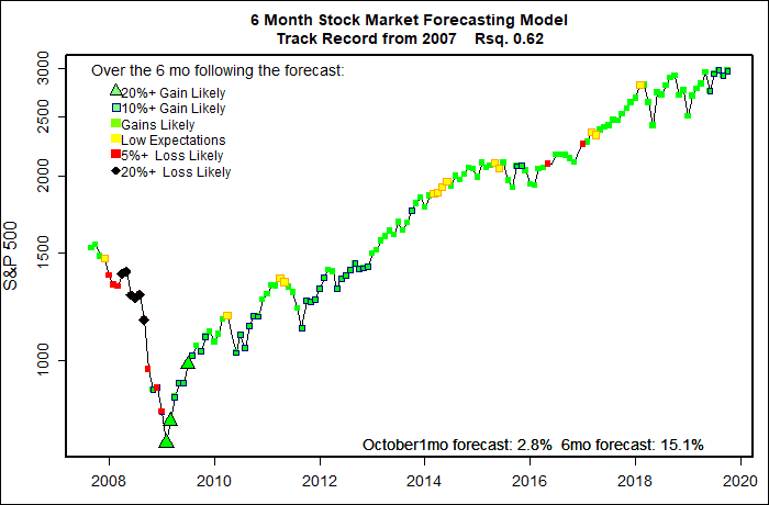
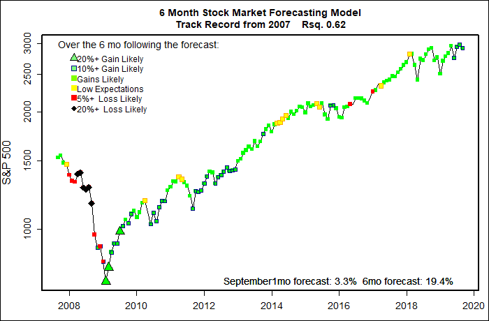
The model’s aim is simply to point out if stock market indexes are grossly distorted and are ripe for a major correction. The model does not say ‘when’ a correction will occur; that’s the purpose of my 6-month stock market model. But, the long term stock market model will tend to give a solid indication of the direction of the next major market move and some guidance on the likely magnitude of a coming correction.
From the Beginning
With a bit of distortion, the stock market reflects the economy, and from the dawn of civilization the world economy has been growing — not at a steady rate, but at an increasing rate. The chart below from Wikipedia.org shows per capita GDP growth since 1500. Data is available elsewhere showing that growth has been increasingly-increasing for the past half million years! More people, more accumulated capital and capacity, and advancing technology (very broadly defined) are the reason for this amazing growth. It has been far from steady (e.g. the Black Plague, World Wars) but growth has been relentless. The rest of this blog post shows that the same basic exponenetial-exponential growth rate is still intact.
(Credit: By Qwfp – Own work, CC BY-SA 3.0, https://commons.wikimedia.org/w/index.php?curid=7122503)
Increasingly Increasing Growth Since 1871
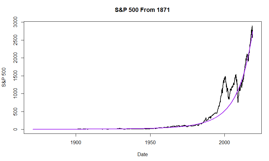
The Standard & Poor’s 500 Index is probably the most widely recognized index for U.S. stocks. It began as the Standard & Poor’s Composite Index in 1923 and assumed its present form in 1957. Data is available, however, going back to 1871 that is based on the principles used to calculate the index.
Running a statistical regression analysis shows that the S&P 500 Index has grown at a fairly constant rate for that century-and-a-half period — despite booms, busts, wars, countless leaps in technology, a developing world, and innumerable changes in government, from when the U.S. had 13 fewer states and the “talking telegraph” (telephone) was invented. It was not a random process. We know that too many factors to count do, indeed, impact the stock market day by day, week by week, and even decade by decade. None the less, a simple, fairly steady growth curve describes roughly 150 years of stock market history remarkably well. In the long run the stock market isn’t so crazy after all. Thank the Law of Large Numbers for that.
Stock market growth has not been perfectly constant. Instead, the rate of growth of the S&P 500 has been slowly increasing. Growth of the Index over time has been “increasingly increasing”.
Inflation has also been a factor in the increasing level of the S&P 500. But, it is not entirely clear exactly how inflation should be factored into the equation. The erosion of the value of the dollar has been far from constant, and there also can be fair disagreements over how inflation gets measured, (For example, a very significant aspect of our recent low inflation has been the radical continuing decline in the price of personal electronics. Does a faster cell phone actually decrease your real cost of living? Or do you just have a faster cell phone out of the deal?) One way or another, though, continuing inflation is part of the picture of the increasingly increasing level of the S&P 500.
The graph below shows the best fit of an exponential-exponential trend line with the S&P 500 Index.. The correlation between the S&P 500 and the simple steady growth path is 0.95 — where a correlation of 1.0 would be a perfect match and 0 would be no match at all. At first glance it looks like the trend curve and the actual Index match incredibly well except for two glaring divergences which turn out to be the Dot Com Bubble and the Great Recession. That is very far from the truth. The curve fit in earlier years was not as smooth as it looks and the recent divergences were not as bad as they look in this graph. Next, let’s see why.
(Click on image to enlarge.)
Percentage Growth is What Matters
The graph below also shows the path of the S&P 500 Index since 1871 with the same exponential trend. It is the same data as the previous graph, but the vertical axis plots the logarithm of the Index value. Each vertical unit is a given percentage change in the Index, not a linear increase. If the market grew at a constant percentage rate the resultant plot would be a straight line. Since the actual plot curves up smoothly, it means the rate of growth has been slowly and somewhat-steadily increasing.
Focusing on percentage market shifts is essential. It becomes clear that the early years of the S&P 500 were nowhere near as smooth as they appear in the first graph. For example, through the Dot Com crash, on a month by month basis the S&P 500 dropped roughly 650 points, a gut-wrenching collapse of over 40%. In contrast, the Great Crash of 1929 amounted to only about a 25 point fall in the S&P 500 — but that amounted to an incredible drop of over 80%! This log-based plot shows how the Great Depression severely held back the stock market for over a decade. Our more recent Great Recession was a minor blip in comparison. Overall, the Index recently was no more erratic than long ago.
(Click on image to enlarge.)
Sometimes Things Do Go Crazy
From the graph above — and my experienced reality — I take a general view that for, say, 75% of the time the stock market behaves normally. (Literally, its relative value and frequent variations tend to follow a statistical normal distribution very closely with large deviations happening every once in a while.) Investing bubbles and market busts, bull and bear markets are extremes /aberrations from normal market growth.
Through history most investors have not been able to spot the top of large developing market bubbles — they always expect “Greater Fools” to keep coming along. Most people did not see either the Great Crash of 1929 or the Dot Com Bubble coming. The usual cry is “This time it’s different” Probably not next time either. Probably.
So, in building a long term trend model let’s drop out what the market has been doing for the past few years. With certainty we can identify past bubbles and busts. So, as a definition, in my long term model, bubbles are times in the past when the market was way above the long term trend, and implosions were when the market was way below trend. This is a major simplification of a lot of complexities in the market and the economy. But, it turns out to be a very useful simplification.
The chart below shows the long term growth of the S&P 500 Index after elimination of the most egregious periods when the actual market value diverged from the first approximation of the long term trend. Most of the deletions were related to the Great Crash of 1929 and the Great Depression, I could have gone a bit further in my data pruning and the Dot Com Bubble and Great Recession scars would have disappeared as well. But, with just limited data scrubbing the correlation with smooth exponential goes up to 0.98 (again, 1.0 would be a perfect score.)
In all the analysis that follows, I’ll continue to drop out the largest market crises in order to better define the normal growth of the stock market.
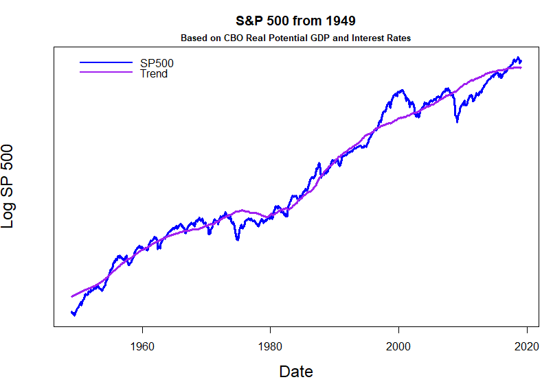
Market Growth from 1949
The Great Depression and World War II spurred incredible increases in the range and quality of economic data collected. Later, computers made it possible to amass a tremendous volume and range of data and to develop sophisticated economic models. To get a more accurate long term model of the stock market we need to bring in additional information content that is only available from 1949 on.
I have a second motivation here beyond just increasing precision. As shown above, we can show that with really surprising accuracy the U.S. stock market has followed an exponential-exponential growth trend. Also, because the U.S. economy is a massive behemoth, we can be pretty sure that the long term trend — even if it shifts — won’t shift all that much in the next few years. But, several current economic factors could make the near term trend vary more than usual. By pulling in the next data stream I can bring to bear another model of long term exponential economic growth that effectively reflects the combined efforts of some of the world’s top economists for the past few decades. By no coincidence, at its core this other model also focuses on exponential-exponential growth.
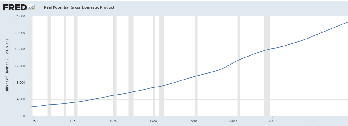
Real Potential GDP The Congressional Budget Office (CBO) is a highly respected, objective and non partisan arm of the U.S. Congress established in 1974. Both political parties and nearly every powerful vested interest group would like to bend the CBO analysis to fit their agenda. That intense and highly bankrolled attention from all sides keeps the CBO model objective. The stakes are very high in this game!
Each year the office issues forecasts of government expenses and revenue along with anticipated 10-year impacts of proposed legislation — but, by its basic rules CBO does not make policy recommendations.
A central part of CBO analysis is a highly detailed sector-by-sector computer model of the workings of the U.S. economy. The details of the CBO model are public, and are subject of extensive outside review. The model is described in 55 pages here. CBO staff make minor adjustments to the model every few years. Because of its pedigree, this model probably has more impact on the views of financial analysts than any other. (Any Econ PhD student, professor or quant lobbyist would find fame and fortune if they could identify a flaw in the model or even just give the model a tweak.)
The CBO Real Potential GDP model closely matches the historical path of actual GDP (adjusted for inflation). But, for the purposes of my long term stock market model, it does not matter much if the CBO model is accurate — it is a major cornerstone of what economists and financial analysts believe to be valid. And, with the stock market “belief” trumps “accuracy” always. CBO Real Potential GDP data — projected 10 years into the future — is available from the Federal Reserve Economic Data (FRED) site here.
U.S. Gross Domestic Product data has only been available since 1949. That is the starting point for the CBO Real Potential GDP estimates as well. It is important to emphasize that the CBO model is focused on how the U.S. economy should perform at a sustainable pace at low unemployment. Also, the model addresses what economists call ” real” GDP — the confusing impacts of inflation are factored out.
There is a small difficulty here, however. The CBO Real Potential GDP model addresses the U.S. economy, not the U.S. stock market. They are far from being the same thing.
The S&P 500 Index grows faster than the U.S. economy. First, since 1949 the relative share of GDP attributable to major industry has increased. More and more we live in a world of gigantic corporations rather than small businesses. Second, the mega corporations that comprise the S&P 500 have become increasingly international in scope. In a continuing process of globalization, growth of S&P companies is not limited by the U.S. economy anymore. Third, over the second half of this period, to reduce shareholder tax burdens, corporations have shifting away from issuing dividends toward seeking faster growth and using stock buybacks to increase stock prices. Fourth, since the early ’80’s the rise of index-based funds, 401k – type retirement investment, no-load funds and ETF’s, and online trading have drawn a disproportionate amount of investing directly to the S&P 500 and its component companies. Fifth, the CBO model is of inflation-adjusted “real” , GDP, not actual raw GDP. To my mind, at least, there is an open question of which sorts of price inflation (commodity, food price, rents, entertainment, etc.) best relate GDP and stock market prices. Each of these 5 factors cause the S&P 500 Index, in particular, to grow at a different rate than the general economy. For these reasons the long term model also includes an empirical exponential adjustment factor to better link the CBO Real Potential GDP and S&P 500 growth rates. (Yes, “empirical adjustment factor” is a contrivance or ‘kludge’ to force a better fit, but I think it is legitimate here.)
(Click on image to enlarge.)
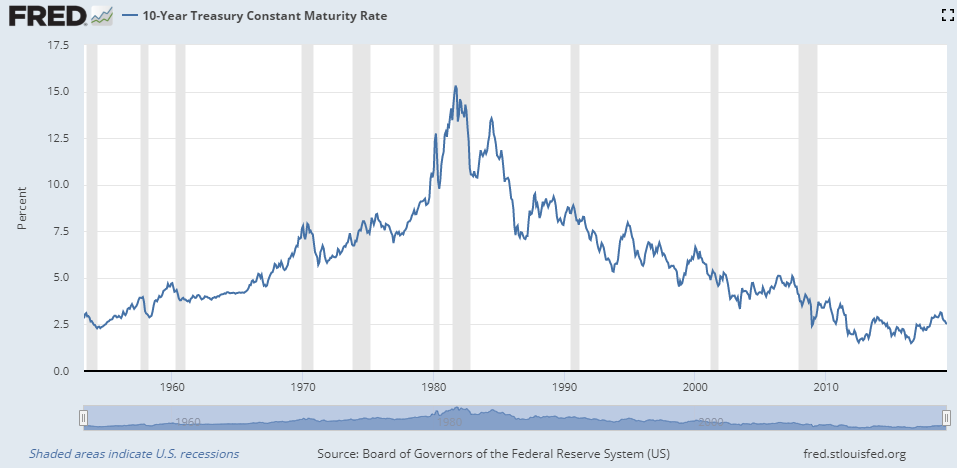
10-Year Treasury Bond Rates Interest rates have a profound effect on the stock market. At the most simple level, it is relatively easy to start a profitable business if your dad gives you many millions of dollars, or even if you borrow your start up money at 2% . But, it would be near impossible to start a business if you can only borrow money at a 40% rate!
Another take on interest rates comes from seeing that owning stocks is an alternative to owning commercial or government bonds, or holding property such as real estate. Changing interest rates makes some investments more attractive than others — spurring massive capital flows from one kind of investment to another. Capital can flow fast, but the relative prices of alternative investments will shift even faster.
Additionally, changing interest rates also have a huge direct effect on business profitability, the business cycle, and recessions. More expensive borrowing directly reduces profits for most businesses. Large increases to interest rates can suddenly shut down the financial system and make previously successful businesses go bankrupt.
Take a bit of time to enlarge the graph of long term interest rates below. Notice that before most periods of recession interest rates rose sharply and significantly — that is the Federal Reserve “taking away the punch bowl just as the party is getting started”. Large and fast increases in long term interest rates bring on recessions. And stock markets tend to crash well before a recession actually begins and often more than a year before a recession is officially announced..
Also, in the period from 1949 to the present there has been a major secular (long term) pattern to interest rates. Over the course of decades long term interest rates increased, culminating in explosive rate increases from roughly 1970 to 1981. The trend then reversed with a continuing decline in interest rates until recently. This prolonged change has had a huge effect on the stock market. Steadily rising interest rates put a damper on the stock market for decades. Market pundits called this slow growth period “stagflation” — stagnant economic growth coupled with high inflation. Then Federal Reserve policy reversed. Interest rates fairly consistently fell and the stock market reaped wonderful gains that were well above the long term average.
That three decade run of good luck caused by declining long term interest rates is over.
Long term interest rate shifts are especially relevant now — in future years interest rates have little room to drop — they can only stay roughly level or go up. The past decade or so of historically low interest rates, besides making businesses more profitable, also led businesses to borrow huge amounts of capital in order to buy back shares of their own stock thereby directly increasing their per-share market price. Further, the residential housing market — a major factor in the economy and family wealth –became based on very low long term interest rates. For homeowners an increase of just a couple percent could lead to a mortgage payment increase of easily 20% to 60%. That would shut down the housing and construction markets and cripple all the businesses that flourish when people move and change houses. When interest rates go up in the next round of increases the negative economic tidal waves may be huge..
The wonderful tail wind of gradually reducing interest rates benefited both the stock market and long term bond investors since 1981. But, that tail wind is gone. The outlook for the next decade of stock ownership is much less rosy than the last few decades. Interest rates are a major key to what happens.
(Click on image to enlarge.)
The next graph shows the S&P 500 since 1949 along with a modified trend line. The modified line factors in long term exponential growth, CBO Real Potential GDP, smoothed 10-year Treasury rates, and a factor to reconcile the difference between GDP and stock market growth rates.
With the addition of Real Potential GDP and interest rates elements, trend correlation goes up to 0.995 if we ignore the excesses of the Dot Com Bubble and the Great Recession. But, if we include all data points, the correlation is still 0.98.
(Click on image to enlarge.)
Consider a Different Kind of Stock Market Index
Look at this next part as a way to gauge market speculation levels.
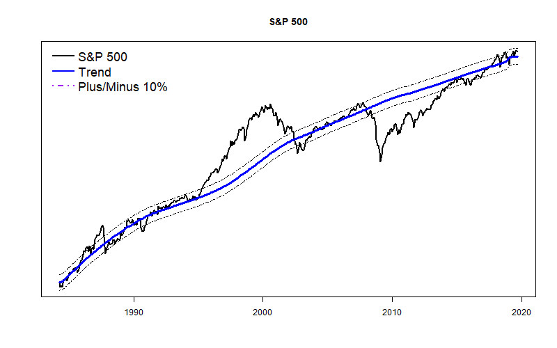
Though the S&P 500 Index is the most widely followed stock market average, it is not the only game in town.
As discussed earlier, the very popularity of the S&P 500 makes it subject to stock market speculation. Vast quantities of index funds and exchange traded funds based on the index mean that incredible trading volumes and dramatic price swings can occur in a flash.
The basic approach by which the value of the S&P 500 is calculated further makes it prone to speculative bubbles and sudden crashes. The Index is based on 500 of the nation’s largest corporations that collectively amount for roughly 80% of total market capitalization. That’s good. But…
The Index is calculated based on the total capitalization of each company (number of shares times the current share price). Those huge corporations are not weighted equally. As this is written, Microsoft Corporation has a weight of 4.11 and Mattel Inc. has a weight of slightly under 0.016. So, Microsoft is over 250 times more important than Mattel.
A net result is that a relatively small number of truly gigantic companies, generally with astronomical Price/Earnings ratios, dominate the S&P 500 calculation. They don’t have to be profitable, just highly capitalized. During a market bubble a small number of companies can become the subject of massive speculation and rapidly rise within the Index, pushing down companies that are less in favor. Once it was the Dot Com companies. Now it is the FAANG companies like Facebook, Amazon, and Apple. Speculative greed can turn in a heartbeat to a panicked stock market crash.
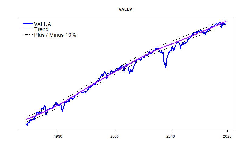
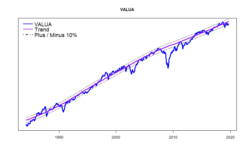
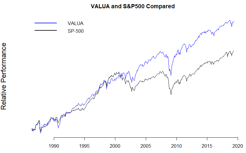
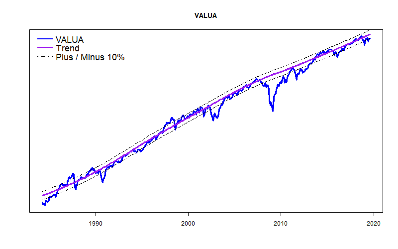
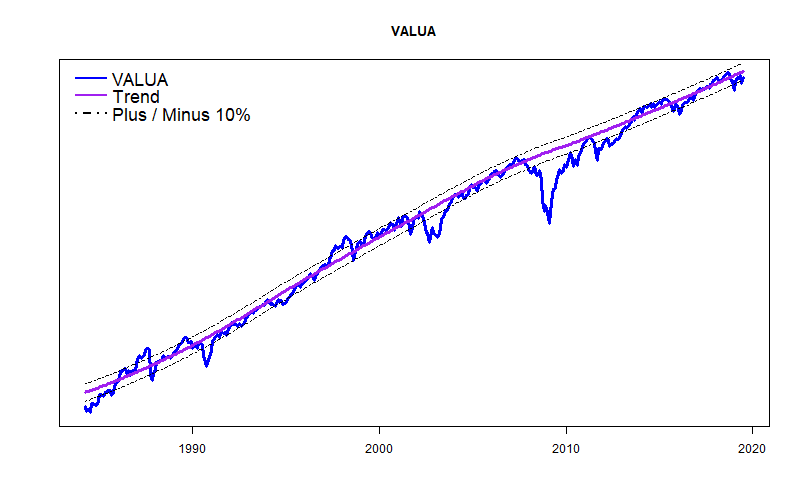
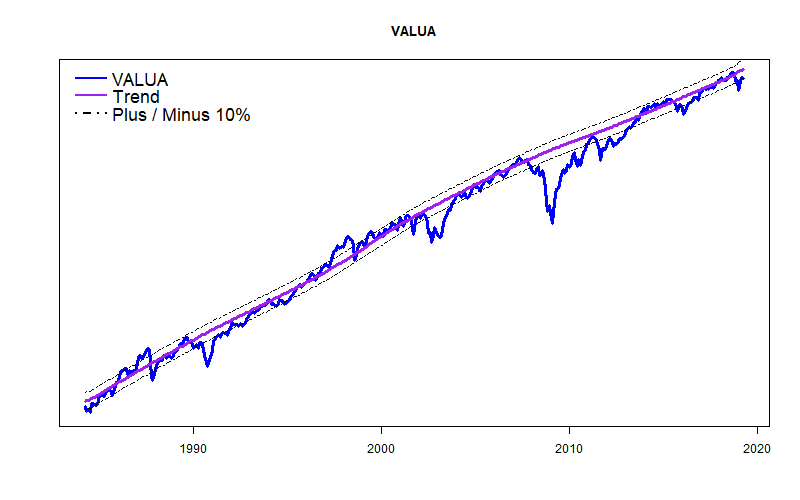
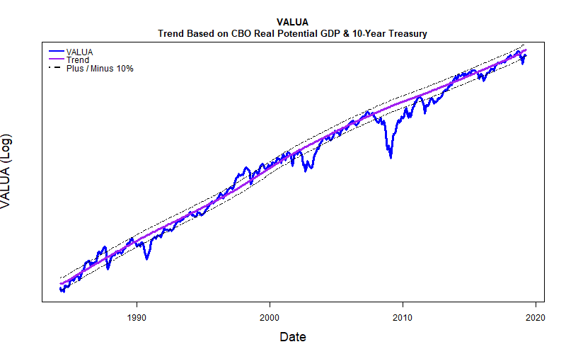
I prefer to follow a major market index, the Value Line Arithmetic Average (VALUA) that includes roughly three times as many companies as the S&P 500, but weighs each of them equally. In VALUA both Microsoft and Mattel count the same — as do many companies you may never have even heard of. VALUA is not currently available as an exchange traded fund. An equal weight fund based on the S&P 500 companies is available with the ticker symbol RSP.
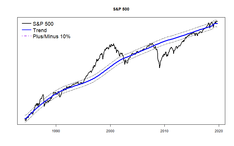
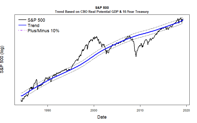
The plot below shows both VALUA and the S&P 500 Index from 1984 to the present. VALUA has performed significantly better than the S&P 500. But, they both experience major market disruptions at about the same time.
Bringing It All Together
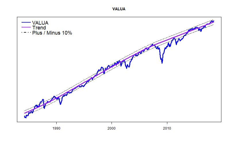
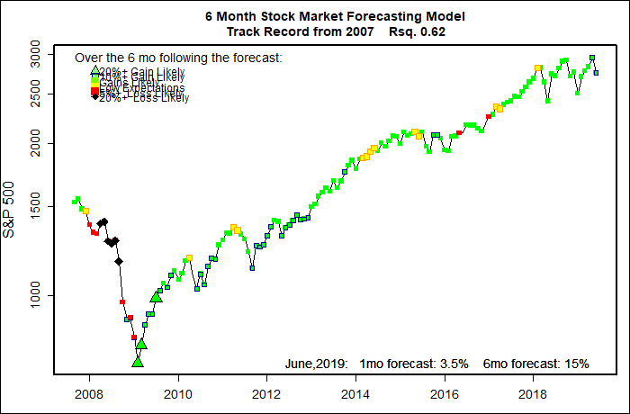
Finally, the two graphs below show the long term trends of VALUA and the S&P 500 since 1984. Both are based on long term exponential-exponential growth, CBO Real Potential GDP and 10-year Treasury bond interest rates. Both show bands that indicate 10% above and 10% below the respective trend lines. I will be showing these graphs in most of my future blog posts. The relative strength of each compared to their long term trend lines should prove to be interesting.
(Graphs shown here are as of May, 2019)
(Click on image to enlarge.)
(Click on image to enlarge.)
And what, after all of this explanation do these charts say? First, both indexes are fairly close their very long term trend lines. That is comforting. Second, both indexes are somewhat above their long term trend lines.
So?
The stock market is a little high, but does not appear to be going really crazy now. The long term odds, of course, favor “regression to the mean” — a small correction.