As I write on July 3, the U.S. House of Representatives has just passed Trump’s massive budget and policy bill; probably to be signed tomorrow. The remaining major piece of Trump economic policy to be settled will be the new large tariffs to be charged to products of all trading partners. Tariff outcomes may come into focus in the coming few months. A smaller, but quite important additional item is what Trump will decide about replacing Jerome Powell, head of the Federal Reserve. With these acts Donald Trump will have completed his redefinition of U.S. economic and foreign policy. Soon, we won’t be talking about the chaotic whip-saws of Trump policy making, but instead major macroeconomic movements will be underway — and not easily reversed.

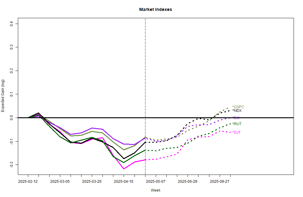
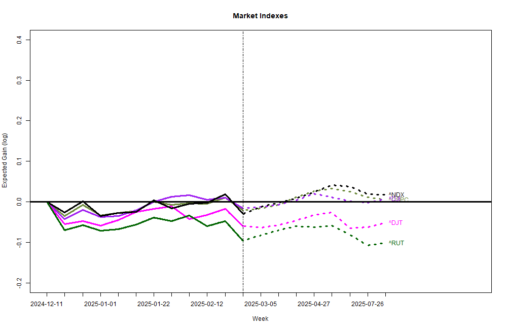
My newer market models (above) are optimistic for the coming 6 months even though they generally see the markets as flat for the next month or so (partly since markets have risen so well this past month). My older models (with nearly 18 years of actual experience) are a bit less positive for the next 6 months, but several variants are distinctly of split minds for the next 3 months.
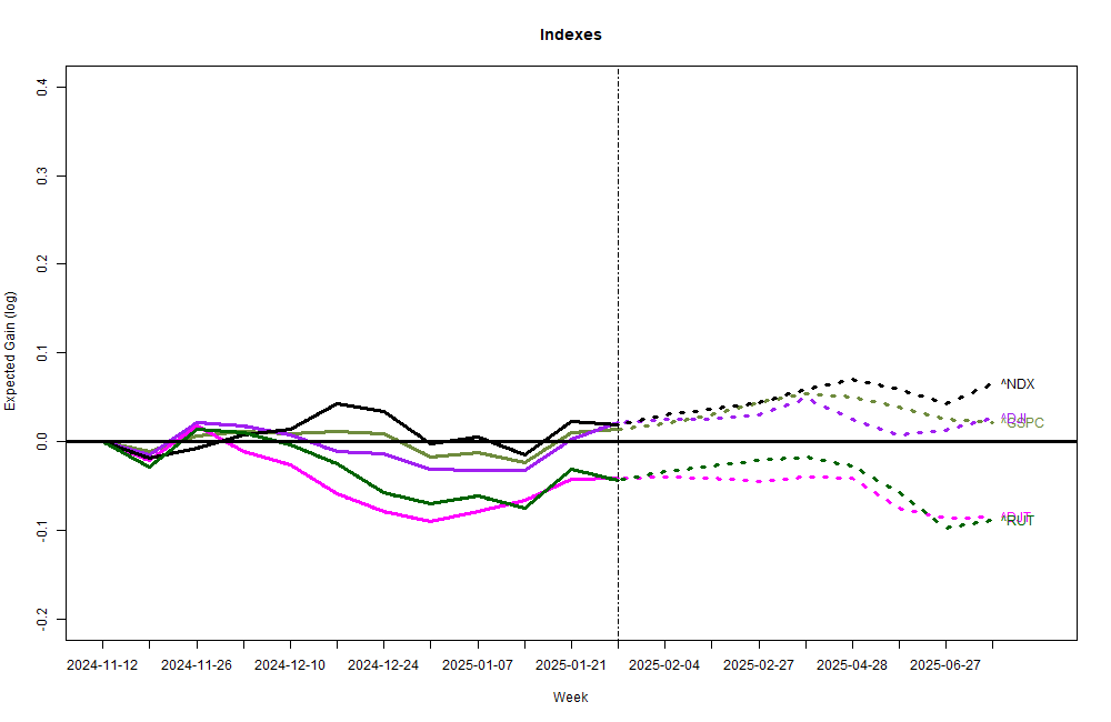
My puny stock market forecasting models only look 6 months into the future, and, frankly, they now are fixated on readings from a single long-standing data source. The models generally are largely unaware of the market distortions that will be created by the new tariffs, and they have only a hint of the significant increase in federal deficit spending or the retribution that world bond markets will enforce when they damn well feel like it. None the less, one leading indicator with a solid track record is flashing bright red.
The big concern of both sets of models is very specific: the current set of forecasts from the Survey of Professional Forecasters a set of detailed forecasts from roughly 40 top-ranked economists that has been recorded since 1968. Most of the other leading indicators I track point to a very low probability of recession or economic trauma in the next few months. The Survey of Professional Forecasters, however, sees a 35% chance of recession in the coming quarter — a VERY high number for this normally quite staid group. Clearly, they are extremely concerned about resolution of tariff turmoil, and doubt that it will end well.
The rest of the world is also worried. The Dollar Index (DXY) measures the performance of the U.S. Dollar against a basket of major national currencies. Since the start of the year DXY is down 10.4% — a major failing and the sword is still falling. The rest of the world obviously has grave doubts about the stability of the Dollar and the U.S. economy. It takes a lot of time to move trillions of investment out of an economy without causing a major alarm and a panic. But, that is what appears to be happening; and more should be expected. The stock market may continue to move up, but your actual wealth invested in Dollar-denominated assets is sliding down the drain. Keep watching DXY. A continued fall spells trouble.
Other than that, everything is great!