Category Archives: Uncategorized

Did these models correctly forecast major bear markets?

The U.S. stock market suffered major pullbacks in 1987, 1990, 1998, 2001, and 2007.  This post looks subjectively at how well my forecasting models previewed those market traumas and the subsequent market recoveries.  They did surprisingly well with the possible exception of the brief 1990 decline.

(Note that the model forecasts for 2007-2009 were made in real time, but earlier dates are evaluated with back-testing data. Also, the market data below refers to market prices at the start of the month and may not match exact market highs and lows that appear in daily market data.)
 

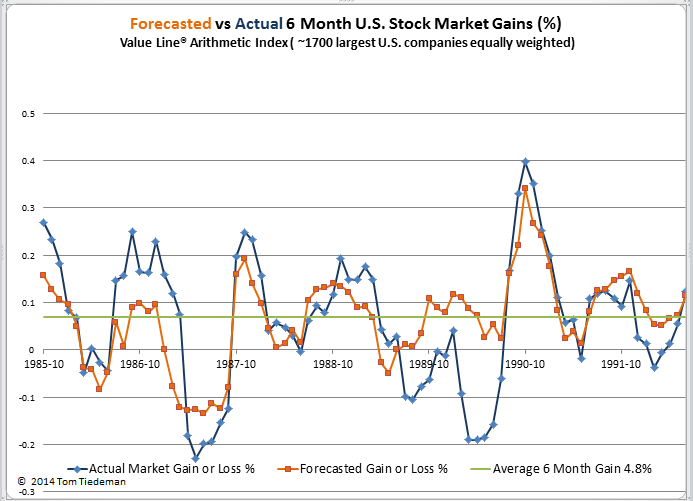
1987 Crash – A big win for the model

On “Black Monday” October 10, 1987, world stock markets crashed. The Dow Jones Industrial Average lost 22% in one day.  Though most of the crash happened in a few days during mid-October, markets had started to roll over as early as August and damage continued into November.  All told, the S&P 500 lost 24% from August through November and the Value Line Arithmetic Index (VALUA) lost 31%.

As shown in the chart below, my stock market forecasting model turned sharply negative in March 1987 – seven months before the main crash. During those spring months of 1987, markets were soaring, reaching one new high after another, but the model, correctly, saw major storm clouds forming.  Then, with the market still crashing in the darkest days of October and November, the 6-month forecasting model turned strongly positive, correctly foretelling the market rebound.
(Click on image to enlarge.)
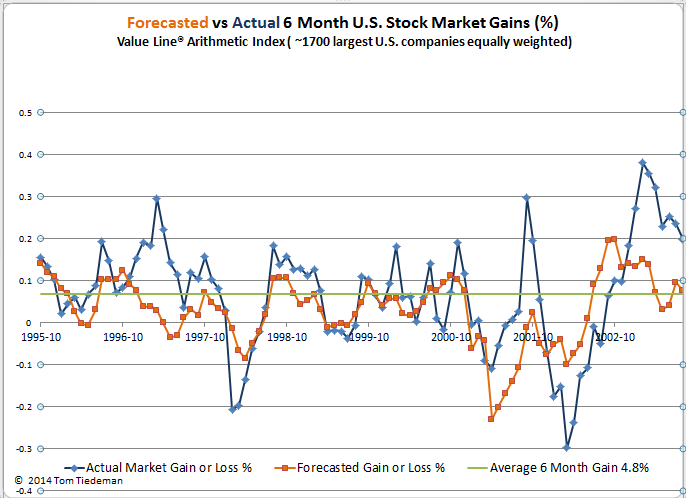
1990 – Missed the correction, caught the rebound

From May through October, 1990 the S&P 500 lost 15% and VALUA lost 24%.  The forecasting model was issuing weak forecasts prior to the sharp correction, but it did not foresee the scale of the correction.  On the other hand, the models did accurately forecast the remarkably rapid market recovery.

1998 correction

During the short lived market correction from April through August 1998, the S&P 500 lost 15% and VALUA lost 24%. The models issued forecasts in March and April of 7% to 8% losses in the months ahead.  The actual losses that followed were approximately twice as bad as forecasted.  The models got the timing of the subsequent market correction correct, but underestimated the 6-month market gains.

 
(Click on image to enlarge.)
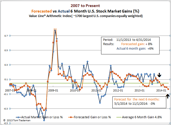
2000 – 2002 Dot Com Bubble
The DotCom Bubble was a speculative buying binge focused on technology stocks – not the entire market.  In total the NASDAQ Composite fell by 78%, the S&P 500 by 46%, but the VALUA suffered only a 20% drop initially.  While the NASDAQ drop was nearly continuous from 2000 to 2002, the VALUA had a rebound through 2001 followed by another 26% drop in 2002 as the U.S. real economy fell into recession.
As shown in the chart above, the models’ forecasts generally matched the timing of the double-decline of VALUA during the period.   The model did not expect the 2001 rebound to be as strong as it was and did not expect the second dip in 2002 to be as bad as it turned out to be. Overall, the model predicted the timing and direction of the VALUA fairly well.
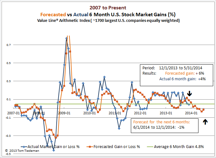
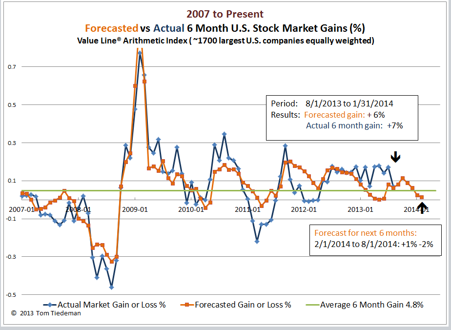
 2007-2009 The Great Recession
Stock markets worldwide were traumatized by a series of financial panics and steep recessions.  Between October, 2007 and February, 2009 both the S&P 500 and VALUA lost 52%. The collapse started slowly with the bulk of the market destruction occurring in late 2008 and very early 2009. Overall, the model forecasted the market well.  It issued weak forecasts through 2007, but by April 2008 it was forecasting a massive 25% decline in the market, well before the steep part of the decline actually began. Likewise, in early 2009 while the market was in the steepest part of the crash, the model issued dramatic positive forecasts for the coming months, forecasts that accurately predicted the subsequent rebound of the market.
 
(Click on image to enlarge.)
Summary
Though the stock market models’ forecasts of these major market disruptions were far from perfect, except for the correction of 1990, they did anticipate the correct timing and general magnitude of the severe market corrections and their following recoveries.
A lesson to learn from this review, however, is that the models truly are future oriented. They do not have much value in assessing how the stock market will behave in the next few weeks. (In August you know that the weather is going to get cold by January, but that is no reason to put on your winter coat in August.)  In general, the models start warning of market disasters months before actual destruction occurs, and they get highly optimistic months before markets finish their crash phase.


Stock Market Probably Flat Through November

My econometric models for the U.S. stock market for the second half of 2014 do not expect any significant change between June, 2014 and the end of November, 2014.   The models forecast that the market will perform like a typical summer period — maybe a minor loss and  somewhat worst than average chance of at least breaking even.  The good news is that this is a slightly better forecast than the models made at the start of May.

The stock market models might as well just suggest that we take a summer vacation and pay attention to other things in life.

Probable market gain from 6/1/2014 to 12/1/2014:   -1%  (Average 6 months since 1984: 4.8%)
Probability of at least breaking even :    50% to 58%  (Average since 1984: 73%).

(click on image to enlarge)

The market models  are a mathematical expectation that the U.S. stock market will react as it typically does to changing economic conditions.  When the forecasts are drastically off, that’s a strong sign that something else — perhaps some sort of  ‘black swan’ — is  moving the market.

Based on the difference between the forecasts and reality for the past half year or so, it doesn’t appear than anything strange has been in play.  In the most recent completed 6 month period, the models expected the market to start cooling off.  Back in December the models forecasted a 6% increase for the Value Line Arithmetic Index  by June 1, and the actual performance was a 4% gain. Pretty close.

The market is moving into the summer months making it probable that the market will weaken mildly.

May 2014 Forecast — A small step down

The summer months are here and the forecasting model expects the U.S. stock market to perform distinctly below average, declining slightly from May through October 2014.

Probable market gain from 5/1/2014 to 11/1/2014:    -3%  (Average since 1984: 4.8%)
Probability of at least breaking even :    46% to 57%  ( Average since 1984: 73%).

(Click on image to enlarge.)

For the most recent completed forecasting period, September through April, the model did well. It had forecasted an 8% gain in the market (measured via the Value Line Arithmetic Index) while the actual gain was 6%.  For the past year the market has generally turned in better than forecasted gains.

Hopefully that strong relative market performance will continue.  Unfortunately, in the past few months the market has stalled as the model had expected.  The overall market has been flat, but the key technology and cyclic sectors have turned south.

Possibly the best free stock market valuation guide

The Morningstar.com  Market Fair Value graphs , updated daily since 2001, provide an objective assessment  whether the U.S. stock market is over-priced or underpriced.  What’s more, there is no charge to view the graphs and they appear to have a remarkable track record.

(Click on image to enlarge. Copyright Morningstar.com)


Morningstar. com describes their proprietary Fair Value assessments as follows:

” At Morningstar, our analysts estimate a company’s fair value by determining how much we would pay today for all the streams of excess cash generated by the company in the future. We arrive at this value by forecasting a company’s future financial performance using a detailed discounted cash-flow model …  that factors in projections for the company’s income statement, balance sheet, and cash-flow statement. The result is an analyst-driven estimate of the stock’s fair value.”

The Morningstar.com Market Fair Value graph sums up the individual company ratings  several ways:

  •  All rated stocks
  •  Sector
  • Super sector
  • Industry
  • Fair value uncertainty
  • Index (NYSE, NASDAQ)

I use a simple reading of the Morningstar.com Market Fair Value charts. I concentrate on the “Max” time setting for “All rated stocks” in order to get an overall perspective of market valuation over the past few years and months.  If the current rating is near fair value (1.02 today) I go back to drinking my morning coffee.  If the rating is more than about 1.05 I worry that the market is getting pricey, and above 1.10, I think seriously about cutting back on stocks.  A rating below  0.85, which seems to occur every few years, gives me good confidence that stocks are in “buy” territory.

Anticipating Summer Stock Market Blahs

(I will be on vacation for a couple of weeks, so I am posting this stock market forecast early. New data in the next few days might nudge the model’s  6 month stock market forecast a bit, but probably not by much.)

According to the econometric model I developed, the U.S. stock market from this April through September should perform a little worse than average. The model forecasts the market nervously ending up right where it is. Intuitively that seems reasonable for what is statistically the worst part of the year. The chance of the stock market at least breaking even is roughly 50% — distinctly worse that the normal 73% prospect of surviving intact.

For months and months, the good news for the stock market has been that the economy remains in tough straits, still needing a level of stimulus from the Federal Reserve that was unheard of before The Great Recession.  It got named The Great Recession for good reasons. As long as the economy is in tough shape it has room for improvement which is good for stock prices. Don’t fight the Fed!

The bad news for stock market gains is that the economy and the stock market have improved tremendously from the depths of March 2009 — so there is much less room for improvement than has been the case for the past several years. The net result is that the model expects the stock market to mark time or stall for a while.

Probable market gain from 4/1/2014 to 10/1/2014:    0%  (Average since 1984: 4.8%)
Probability of at least breaking even :    46% to 57%  ( Average since 1984: 73%).

This blog is about testing the econometric model in real time and in plain sight. So, how is the model faring? The forecast from October, 2013, the most recent 6 month period, was for a six month stock market gain of 11% which was almost exactly what occurred. (Measured using the Value Line Arithmetic Index as the standard.).  Sometimes the model just gets lucky. :o) For all forecast results since 2007 look at the graph below.

(Click on image to enlarge.)

Margin debt level is not too high — yet

Recent articles such as this one or this one make the case that the level of  stock market margin debt today is at a dangerously high level. (Data on New York Stock Exchange Margin Debt is available with a two month delay here. )

The articles focus on a chart of NYSE Margin Debt like the one shown below.  The sharp peaks on the graph correspond to the Dot-Com crash of 2000 and the financial panic market collapse that got underway in 2007.  The graph gives the impression that the current spiking of margin debt must be pointing to another market crash coming sometime soon.  Or does it? Maybe the graph isn’t showing the real story.

(Click on image to enlarge)

Margin debt, like the stock market, has a long term trend of growing several percent year after year. Because of this fairly steady growth rate you can get a more helpful view by changing the vertical axis to a logarithmic scale, making the same data look somewhat less scary.

(Click on image to enlarge)

Look at a longer time period (since 1980) and add in a trend approximation line and an entirely different picture emerges — current margin debt is not outrageously high. It may even be a bit lower than the historical trend.

(Click on image to enlarge.)

Even this graph may be making margin debt levels appear more worrisome than they are. In 1987 at the time of the crash margin debt was 68% greater than the historical trend.  In June of 2000 margin reached 130% above trend! And in 2007 margin debt was 67% above trend.  Today, in sharp contrast, margin debt is about 3% BELOW trend.

There are countless things about investing that might be worth fretting. But, today’s level of margin debt doesn’t deserve to be very high on the list of worries. In a couple of years margin debt levels may be worth your attention.

Stock market has been stronger than expected

U.S. Stocks stumbled in January, but came roaring back in February. I had forecast a strong 6 month gain of 8% last September, but the market more than doubled on my expectations with a 17% burst!  As far as my models are concerned I’ll still call that a win — the forecast was for the market to go up nicely and it did. The models are not expected to be accurate. The goal here is just to usually anticipate the market’s general direction.

The model’s forecasts from 3/1/2014 to 9/1/2014  are weak and falling.  The market, of course, will do what it wants.  But, factors that historically have affected the market are weak. Not bad, just anemic.

 Probable market gain from 3/1/2014 to 9/1/2014:    0%  (Average since 1984: 4.8%)
                    Probability of at least breaking even :  58%  ( Average since 1984: 73%).

(click on image to enlarge)

Morningstar.com Market Valuation Graph

Want to know if the U.S. stock market is too high or too low? Here is a free chart you can follow.

With more than a decade of published track record, the Market Valuation Graph at Morningstar.com gives Morningstar’s current calculations of  net present value of the stock market — what their analysts calculate the market is worth today based of expected dividends and growth over the next several years.

Here is the link.  I prefer using the “max” time period setting.
http://www.morningstar.com/market-valuation/market-fair-value-graph.aspx

There are probably worse investment strategies than to respond every couple of years to extremes in the net present value calculations that Morningstar compiles and presents here for a vast universe of stocks and then averages together.  Put another way, be careful if you think the stock market is valued far away from the Morningstar estimates — their track record has been amazingly good.

The strategy to using this measure is simple: 

Buy more stocks when Morningstar calculates that the market in undervalued by, say, 10% or more.
Sell some stocks when Morningstar views the market as overvalued by, say, 8% or more.

Then be patient.  It is difficult or impossible to predict exactly when the market will turn course, but this graph shows that year-to-year pricing of the stock market tends to revert toward the neutral “fair market value”.

Sliding Market — Be careful

The U.S. stock market forecasts coming out of my models for the coming 6 months are very weak — definitely worse than average.  Through January the stock market stumbled much like the model had forecasted.  If the market and the economy behave in a  fairly typical fashion, my forecasts over the next couple of months will continue to slide, and the market may well do worse than my models predict.  Sorry about that.

Probable Market Gain:                 1% to 2%         (Average since 1984 4.9%)
Probability of Breaking Even:    57% to 60%       (Average since 1984 73%)

 
(Click on graph to enlarge.)

Too Many Holiday Treats for Investors

My stock market price performance models forecast a weak first half of 2014 for the U.S. stock market (Value Line Arithmetic Index as proxy for the broad stock market):

Probable Market Gain:                 2% to 3%         (Average since 1984 4.9%)
Probability of Breaking Even:    60% to 65%       (Average since 1984 73%)

(Click on graph to enlarge)

The U.S. stock market partied hearty during the second half of 2013, and it may be time for sobering up.  My models had made a strong positive forecast back in July for an 8% gain through the end of 2013 — but the market rose a joyous 17%!  Many of the fears holding back the market simply evaporated:

Congress approved a budget and appears likely to avoid a debt default crisis.
The Federal Reserve ‘promised’ a very slow tapering of financial stimulus.
The economy continued to gradually improve.

Sadly, the stock market can’t keep growing at a 38% annual rate forever, or at least that is what my econometric models say. The stock market, of course, will do whatever it will, and the rush of the Bulls could keep running for months.  I have a gut feeling that the party will stop pretty soon, quite possibly in bone-chilling January or dreary February. I have a hunch that I wasn’t the only nervous investor who resisted selling in December in order to avoid paying 2013 income taxes on my 2013 gains.

Here is the short-term market indicator that I plan to watch: a plot at StockCharts.com of the relative performance of the S&P 500 versus a long-term bond fund:

http://stockcharts.com/h-sc/ui?s=IVV:IEF&p=W&b=5&g=0&id=p13375668178

When stocks start performing worse than bonds your worries are being confirmed.