Author Archives: tomtiedemangmailcom

Stock Market Trend Line — Part 2

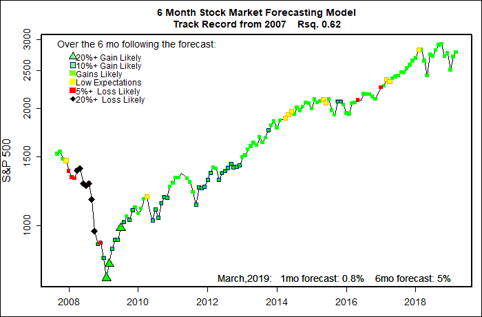
(This post does not contain a new market forecast.)

In brief: The stock market is tied to the economy, but the link is not all that direct.

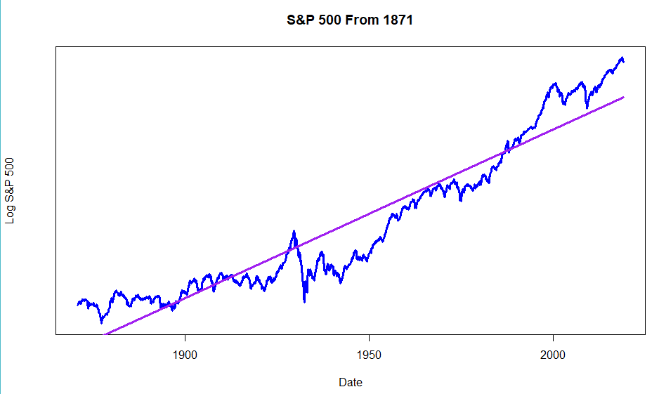
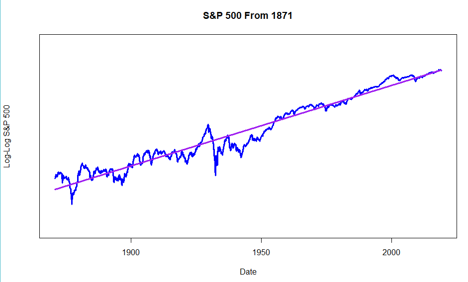
Part 1 of this Trend Line series argued that the U.S. stock market — despite all of it’s booms and busts —  has grown at a surprisingly steady percentage rate (exponential growth) rather than by a steady or random number of points each year (linear growth). It even looks like that growth rate has been going up a bit, somewhat consistently, over the long haul, making long term market growth ‘increasingly-increasing’.

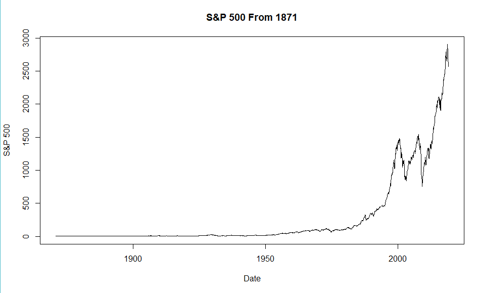
 The S&P 500 data I presented in Part 1 began in 1871, but researchers have shown this same sort of increasingly-increasing growth has occurred  for human economies from the dawn of civilization.

The economy dominates stock market performance. Sort of.

The U.S. government didn’t collect much economic data until the Great Depression, and only really became serious about it during WWII.  The first publicly available GDP data is from 1947.  So, the focus here will be on the stock market since that time.

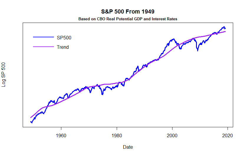
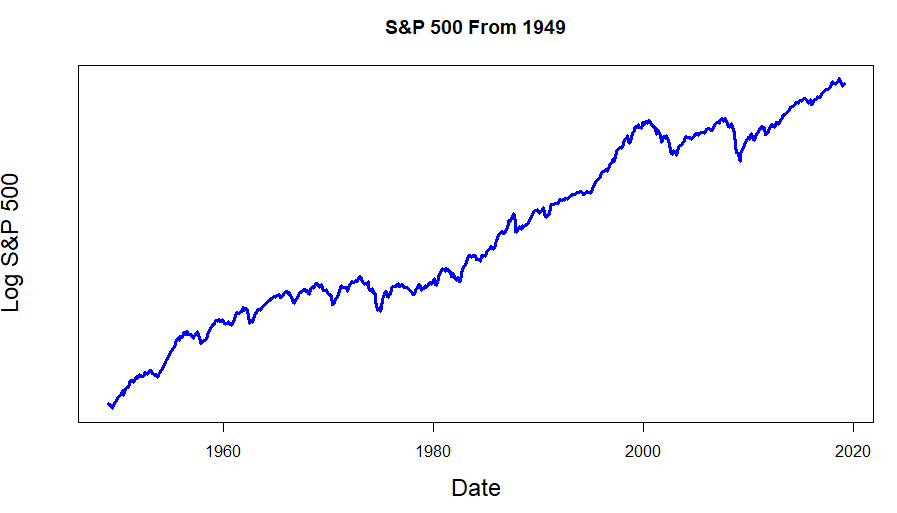
In the post-1949 graph of the S&P 500 below, the Y axis is linear.  Just like the 1871- graph in Part 1, it shows the characteristic upward swoosh.  Again, the immediate appearance of the graph is that the market was flat for years and years, then suddenly shot up.  And there were those two crazy bubbles of the DotCom episode and Great Recession.

(Click on image to enlarge.)

Plotting the same S&P500 data with the Y-axis showing percentage growth (logarithmic) smooths  the line out, making it more linear. Also, volatility of the early years comes into perspective — volatility in percentage terms has not increased dramatically in recent years. Overall, the stock market has experienced a roughly steady rate of growth.

(Click on image to enlarge.)

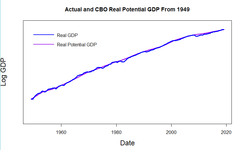
To factor economic performance into the new market trend line, I am turning to the combined talents of scores of the top U.S. and world economists — living and dead — including several Nobel Prize winners.  The best data I have found to track  and forecast the economy is  the Real Potential Gross Domestic Product created and maintained by the Congressional Budget Office. “Real” in the name means that inflation has been factored out of the data. Interestingly, the S&P 500 matches an inflation-adjusted Real GDP better than unadjusted data.  “Potential” means that the CBO Real Potential GDP comes from an elaborate model  designed to mimic the U.S. economy running near it’s full potential. During an economic boom the economy may run somewhat above potential, but only for a few years at most. Likewise during a recession GDP may drop as much as 10% below potential, but tends to recover over several years.

The CBO Real Potential GDP adds a lot of power to my market trend line. First, it is the best known model there is, and for good reason.  The CBO model is the tool used to evaluate the 10 year economic impact of all proposed congressional legislation.  In the hope of making their proposed legislation score better, every congress member, and every interest group tries to get the CBO model tweaked. For that reason the CBO model is fully documented, transparent and heavily peer reviewed. It is unaffected by politics.

 In the professional world of young top-notch economists the Federal Reserve and the Congressional Budget Office are the top credentials you would want on your resume.  Just writing a paper that suggests a small adjustment to the model is a major kudo for an economist.

As shown in the graph below, it tracks the actual GDP numbers amazingly well. But, even if it was not very accurate, it is the economic model that economic forecasters are most likely to trust, creating a self-fulfilling prophecy effect on the stock market.

Importantly, the CBO Real Potential GDP projects economic performance quarter by quarter for a full 10 years. Actual GDP data, by contrast is always a quarter to half a year out of date. Economic trends that are most probable in the coming decade have already been factored into the model.

Finally, the difference between actual Real GDP and Potential Real GDP is a solid and objective measure of how well the actual economy is living up to it’s long term potential.

(Click on image to enlarge.)

Adding Real Potential GDP and Interest Rates to the trend line

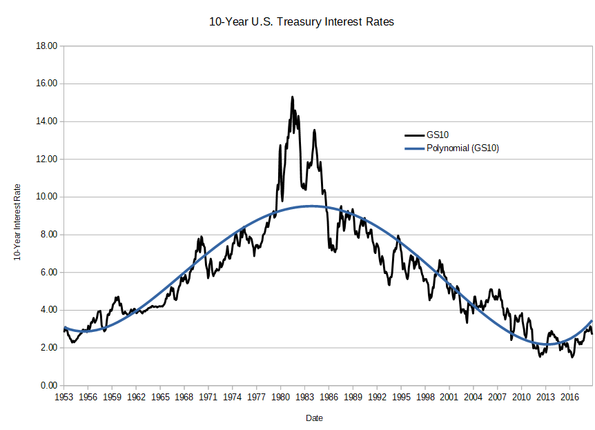
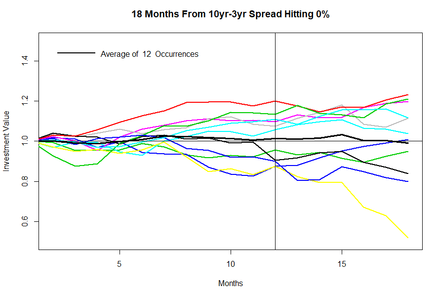
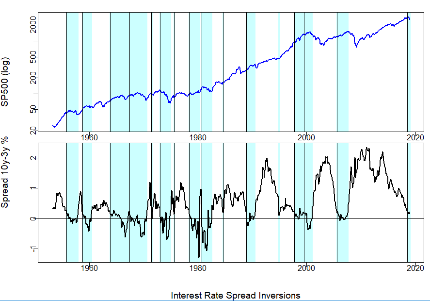
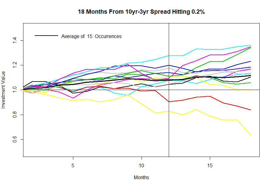
I have added one more piece of information to the trend line model — Interest Rates.  We know from long experience that interest rates and especially changes to interest rates have a major impact on business profitability and the stock market.   The CBO GDP model includes interest rates as direct economic factors.  But, the effects of interest rates on the stock market are somewhat different. Especially since we appear to be heading into a period of rising interest rates, it is important that the trend line reflect changing rates.

Adding the CBO Real Potential GDP and data on prevailing interest rates to the existing exponential trend line produces the trend line for the S&P 500 shown below. The trend line, now based on objective economic data, appears to conform to past market performance pretty well.

But, this is not the final trend line I will be using.  There are a few more steps that I’ll cover in my next post.

(Click on image to enlarge.)

Stock Market Trend Line — Part 1

(Feel free to ignore this post. It does not offer any current stock market forecasts.)

Pretty soon I’ll be posting what I consider to be an “intelligent” trend line for the stock market and make it a regular part of my monthly market forecast.  What makes the new trend line “intelligent”? Well, it is based on where the market is most probably heading based on very long term economic data. Why does the trend line need to be so smart?  Major structural changes that I can’t ignore are underway in the U.S. and world economy. All of this is going to take a few posts to explain.

Increasingly Increasing Growth

The S&P 500 is probably the most widely followed stock market index. It is a capitalization-weighted index reflecting the combined stock prices of  most really gigantic American corporations. (i.e. Huge companies have a much greater impact on the S&P 500 than do merely big companies.) In 1923 the “Composite Index” had just a few stocks, by 1927 it had 90 companies, but it was not until 1957 that it included 500 companies.  Robert Shiller (“Irrational Exuberance”) has posted extrapolated S&P data going back to 1871 that is the basis of my charts below.

The first graph shows the value of the S&P 500 from 1871 to the present.  It shows the classic upward swoosh that characterizes exponential (compounded) growth of a few percentage points each year.  But, a first glance it appears odd — like the market did almost nothing for about a century, then started an increasingly steep climb — almost straight up!  What about the two crazy bubbles recently ( the DotCom Bubble and the real estate bubble that led to the Great Recession)?  Where is the Great Crash of 1929? Not even visible.

(Click on image to enlarge.)

Plotting the logarithm of the price makes the graph show percentage growth rather than nominal growth..  A steady rate of price increase will show as a straight line (purple).  ‘Bumps’ or ‘pot holes’ along the way match the percentage change of each market episode. So, this next chart shows the same data for the S&P 500, but the Y-axis now measures percentage change. The plot looks a bit straighter, and the huge spike and crash of 1929 is now clear.  But, to my eye, it still looks like the curve has an upward swoosh.

(Click on image to enlarge.)

Turns out, the S&P 500 hasn’t just been increasing at roughly a set rate.  Instead the rate of increase has been increasing at a somewhat steady pace!  That’s the story of this next chart. The Y-axis now shows the the logarithm of the logarithm of the SP 500. (Sorry math-o-phobics!)  And the straight ling approximation now looks pretty good. (R-squared = 0.95)   So what?  The world is about to go through a couple of huge changes in the next few decades.  They are already starting to affect the stock market.

(Click on image to enlarge.)

First the good news.  We live in the developed world.  The stock market is totally a creature of that developed world.  Here’s the shocker: today only about 1/6 of the world’s population lives in developed world conditions.  The rest of the world is about to play catch-up, much like China has been doing for the past few decades.  The next two or three decades are very likely to see an explosion of world development and hence further explosive growth of the stock market. So, the positive angle is that any sort of ‘intelligent’ stock market trend line needs to be acutely aware of this coming world development. Most of the growth will occur outside the U.S., but U.S. multinational companies will undoubtedly catch a big share of the coming world growth.

Now the bad news.  Rapid world development is already causing huge problems.  Everyone is not benefiting equally.  Huge numbers of people in the U.S. and all over the world already feel left behind. That is part of the Trump revolution. But, it is also part of many other phenomena like massive migration happening all over the world.

And there is another big risk hanging around.

I vividly remember the very first time I saw a long term exponential growth curve. I was 12 years old.  It scared the hell out of me and I still remember it vividly.

It was the very first day of my seventh grade science class in 1959.  Mr. Abrams, the teacher, projected a view-graph on the screen that had this great big upward swoosh. He said that this was a developing world problem that wasn’t causing big problems yet, but someday it would. 

The graph was of carbon dioxide levels in the atmosphere.

Carbon dioxide levels have, of course, continued to double and double — at an increasingly increasing rate.  World emissions are roughly 700% higher than they were when I was in seventh grade.

Today, it is still possible, perhaps, to debate that  meaningful climate change has occurred. But, it won’t be possible to debate the effects much longer. 

We in the developed world use several times more fossil fuels per person than people in developing countries. If the developing world starts to use fossil fuels like we do, then carbon dioxide levels will explode higher.  Given the momentum of world development, much of this rise in carbon dioxide over the next few decades is essentially guaranteed.

So, any ‘intelligent’ trend line for the stock market needs to be closely attuned to these huge world changes. We need to closely watch what is happening.

Fortunately, several hundred economists have helped me in creating my new trend line.  But, that story is for another post.

Annual Carbon Dioxide emission in billions of tonnes since 1750. The right hand axis shows this amount as a percentage of teh amount of carbon dioxide that was in the atmosphere in 1750.

March thru August, 2019 — Expect continuing volatility

The statistical forecasting model says:
March, 2019:  +0.8%  (A bit above average)
Next 6 Months: +5% (Slightly above average)
Probability of at least breaking even: Not clear.
What am I doing? Fully invested.

I wouldn’t pay much attention to this month’s forecast.  My prediction models do pretty well at forecasting major stock market moves.  But, when the market is not enduring some sort of major earthquake the ‘noise’ of near-random market activity is greater than any sort of ‘signal’ that overall economics are sending to investors.  That’s where things are now.

My stock market forecasting models remain generally favorable — not enthusiastic, but they continue to give the market the benefit of the doubt. 

The models that forecast the probability of at least breaking even over the coming half-year and not in agreement. They range from highly positive to even odds. At least they are not highly negative.

Interest rate questions are definitely affecting my models and they appear to be driving investors into a nervous breakdown.  The spread (difference) between short and long term rates is very tight, and it will probably stay tight for quite some time.  The stock market can probably hold on as long as the governors of the Federal Reserve maintain their “patient” attitude toward rate increases.


(Click on image to enlarge)


A Prolonged Secular Interest Rate Expansion Underway

Since roughly 1980 , in fits and starts, long term interest rates fell. That period is over.  Rising — not falling —  long term interest rates will be major economic and investing news for decades. Cross your fingers that the transition is very, very slow and smooth. But, of course, it won’t be.

 In performing a ‘tweak’ of my forecasting models it has become clear that I need to adjust the way that rising long term interest rates are factored in.  This is not just the common ups and downs of rates that accompany the business cycle.  The concern here is a relentless long term (secular) escalation in interest rates.  This post tries to offer an overview.

The chart below shows interest rates for 10-year U.S. Treasury issues since 1953.  The blue curve shows a smoothed interpretation of the data.  With many ups and downs along the way, Treasury yields rose to astronomical heights near 1980 and since then rates have fallen. Rates did not fall fast or steadily, but they did fall.

Rising and then declining inflation has been a big part of the story. For any loan to be profitable the interest rate charged needs to include a “real” rate of return that is somewhat above the prevailing inflation rate. In 1980 inflation rose as high as 14% while today it is closer to 1.5%.  So, much of the decline in interest rates is the result of declining inflation.

But, declining inflation is not the entire story. Real (inflation adjusted) interest rates fell as well.

(Click on image to enlarge.)

The next graph puts the current interest rate situation in perspective — a 700 year perspective!

In November, 2017 Paul Schmelzing wrote about real interest rate variations since 1311 in a blog sponsored by the Bank of England. His chart (below) shows the 700 year story of inflation-adjusted interest rates.

As he points out, cycles in interest rates are the norm, not the exception.  And the overall trend for hundreds of years has been slowly declining real interest rates.  An economic calamity (like the Black Plague!) could send real interest rates either sky high, or negative, for a relatively brief period of time.  But, over the span of history the overall rate trend has been down.  Near zero rates as we have seen over the past decade, however, are about as low as they can go.

Reason and history suggest that the still-low rates that we have are highly unusual.  Real interest rates can stay fairly low, but they are not likely to stay this low forever. From here, rates can stay roughly level, or they can go up. The four decade period of declining rates we have experienced has drawn to a close.

(Click on image to enlarge.)

The Federal Reserve has made very clear that they want to fully back out of the ‘extraordinary’ measures needed to break out of the Great Recession. They want to see somewhat higher inflation, somewhat higher interest rates, and they want to reduce the $4.5 trillion in long term bonds they hold in their portfolio.

But, actually breaking out of the low interest rate regime is going to be exceptionally difficult.

First, any move to increase rates or reduce the Fed portfolio will depress the economy. That’s Econ 101.  So, at best these moves will be unpopular.  President Trump, for example, has said: “… I’m not blaming anybody, but I’m just telling you I think that the Fed is way off-base with what they’re doing.”

The crucial ‘spread’ between long term and short term interest rates is already vanishingly small. It would not take much of a rate increase to bring on a recession.

Second, about half of the Fed’s portfolio consists of long term property mortgages. Dumping those holdings will raise mortgage rates in particular. But, the real estate market and residential construction are already hurting.

Rising long term interest rates have raised the real cost of buying a home.  Already, real estate agents blame a slack market on people not wanting to give up their great long term mortgages in order to trade homes. The Trump tax cuts also hurt the housing market.  Both the cuts in itemized deductions for state and local taxes and the increase in the standard deduction mean that far fewer people will receive actual benefit from a home mortgage deduction. With less benefit from the mortgage tax deduction, the perceived desirability of owning a home goes down. Most recent U.S. recessions have been led by decline in the housing sector. And, a decline appears well underway. The most recent comments I have seen indicate that the Fed will be backing off in cutting their portfolio.

Third, interest rates are still so low that proportionate changes in rates are critical.  When rates are high, say, 10% a single percentage point of rate change is relatively unimportant — just ten percent.  But, when rates are near, say, 4%, a percent increase in rates amounts to a whopping 25% increase in borrowing costs. It is especially difficult to raise very low interest rates without causing major economic disruption.

And finally, the Federal Reserve does not want to drive the economy into recession.  Even though unemployment is at historically low levels, natural inflation has not grown much.  The Fed does not see a clear need to take froth out of the economy. They certainly don’t want to head back anywhere near the Great Recession.

I don’t know what the Federal Reserve is going to do next.  But, I will guess a couple of things that might be on the wish list.

My guess is that the Federal Reserve would really like to see some major deficit spending.  Tax cuts won’t be much help — most tax cut money goes to the wealthy who invest, not spend much of their additional money.  The Federal Government really needs to start spending lots of freshly printed dollars to heat up the economy.  A huge infrastructure program would do the trick, especially since it can be dialed up or down to keep inflation under control.  A significant increase in inflation would give the Fed some cover to slowly raise interest rates.

I’d also bet that the Fed wants investors to stay a bit scared — not really scared so that the markets would crash, but scared enough so that a major price bubble does not develop. In fact, I bet you can expect periodic grumbles and growls form the Fed that effectively keep bubbles in check.

Expect continued fairly high volatility.

Investor Fears Fall

The statistical forecasting model says:
February, 2019:  +1.3%  (Above average)
Next 6 Months: +6% (Somewhat above average)
Probability of at least breaking even:  Different models, different outputs

My models expect the current market rebound to continue, but not as any sort of huge bull market rush.  The tools I use to estimate a probability of breaking even over the next six months give conflicting readings.  My guess is we should expect fairly high market volatility to continue.


(Click on image to enlarge.)


Every couple of years I make small adjustments to my forecasting models.  Based on a decade of forecasting experience, the economic data and indicators that actually point to future stock market moves really do not change very much. But, they do shift a little, leading me to tweak my models just a bit.

It is hugely encouraging that the leading indicators I started using a decade ago still do a pretty good job of forecasting major moves of the U.S. stock market.  It is easy to take a bunch of economic data and hammer it into a mathematical model that matches a stretch of past market action. That does not mean a forced model will give solid forecasts in the future.


In a paper published two decades ago, mathematician David Leinweber and portfolio manager Dave Krider demonstrated the foibles of data crunching by showing that butter production in Bangladesh had the tightest correlation to the S&P 500 of any data series they could find at that time. Combining that with U.S. cheese production and the number of sheep in Bangladesh their three-variable model “explained” 99% of the S&P 500’s movements. Correlation is not causation.


Anyway, in reviewing my forecasting models I have been looking a lot at interest rates.  More than most any other factor,  rapid shifts in interest rates have a major impact on the stock market. Raise interest rates quickly enough and even the strongest business will be in financial distress.


In particular, I have been looking at interest rate spreads — differences in rates for short term loans versus long term loans.  Normally a short term loan for, say, 90 days will have a much lower interest rate than a long term loan or bond, like a 10- year bond. The argument is that a lot can happen (like rising inflation) over several years that could destroy the value of the long term loan.  


Sometimes, however, short term rates can be higher than long term rates.  This “inversion” of the normal pattern is usually a signal of a coming economic recession, and is generally very bad news for stocks.


Sure, it’s a boring topic, but fear of a an imminent interest rate inversion was the main force driving the panic selling between October and December, and the fairly spectacular market rebound in January.


The two charts below show the S&P 500 (top graph) and the spread between the 10-year and 3-year U.S. Treasury bonds since 1953.  The vertical black lines flag where the interest rate spread hit zero.  It is not a perfect match, but following the rate inversions the market often tanked.

(Click on image to enalrge.)

The next graph shows what happened to the S&P 500 in the 18 months following each of these interest rate inversions.  Sometimes the market went up, and sometimes down.  But, the average (the heavy black line)  went down some, but not too much.  Investor fear comes from seeing that a few of the rate inversions led quickly to market catastrophies.  (By themselves, interest rate spreads are not very accurate market predictors.)


So much for the scare factor — interest rate inversions can lead to very bad outcomes.  The good news is that currently most of the spreads in interest rates have not hit zero or inverted.  The 10year-3year spread is still one-fifth of a percent — not much, but some.

The Federal Reserve Board at its last meeting telegraphed that they are also concerned about the tight interest rate spread and are likely to pause further increases in interest rates.  They may also slow or stop selling off their huge portfolio of long term bonds that they bought to stem the Great Recession.

The graphs below shows what has happened when the 10year – 3year spread does not drop all the way to zero, but just to the current level of 0.2%.  On average the stock market goes up — not always, but often.

So, don’t worry too much just yet.

(Click on image to enlarge.)


Correction – Still Love Them Quitters

Sorry about the last transmission.  This post was my first attempt to include interactive graphs from the Federal Reserve Economic Data site.  They looked great in the actual blog, but did not transmit correctly in the email subscription.  This correction includes the fixed graphs.  

I will also  add an apology in advance because I will make a few more tries at including the FRED interective graphs.


SPOILER: People are quitting their jobs at a high rate, meaning they are not afraid about what is happening in the economy.  That is good news — while it lasts.

To create a major stock market crash you need to get a lot of people very frightened all at the same time. Put another way, if nearly everyone is calm, happy, and optimistic about their economic futures it is not likely they are all going to panic any time soon.  So, it is worthwhile finding an economic indicator that tracks the nation’s basic trust in the economic health of the country.

I like to track the number of people who quit their jobs each month.  Inherently people who quit their jobs are optimists. They voluntarily leave a somewhat safe job in order to jump into something else they hope and expect to be better. They are betting their whole future! Quitting a job is a very big deal. Most people will be cautious. If people are really worried about the economy, they probably will hunker down in their current job until times get better.

There are, of course, plenty of job quitters like new retirees and people with health problems who don’t fit the optimist profile. And there are a large number of seasonal quitters like college students giving up their summer jobs.  But, once you discount a baseline, the fact remains that a large, and probably fairly constant share of people who quit their jobs are showing a vital belief in a better future.

The government has been tracking unemployment since April of 1929. (Hmmm… The Great Crash happened in October, 1929.  Were economists already getting worried much earlier?) But, for stock market prognostication unemployment data is not all that helpful — it lags rather than leads stock market activity.  Businesses have tended to hold off on laying people off until absolutely necessary.

In 2000 the Bureau of Labor Statistics started tracking job quits on a monthly basis in their Job Openings and Labor Turnover Survey (JOLTS).  The data is available for free at the Federal Reserve Economic Data (FRED) website.  https://fred.stlouisfed.org

The monthly data has a great deal of repeating seasonality. Most quits are always in August. Least job quits occur in November, December, February, and March.  FRED also provides a seasonally adjusted version of the data.  The second graph still shows a lot of apparently seasonal variation, but it is smoother than the unadjusted data.

This is a fairly new data series, so it is important not to jump to conclusions all that fast.

That said, Job Quits began to level off in 2005, well before the 2007-2009 stock market crash and well before the subsequent recession.

Current job quits are at a high level.  That is encouraging.  Should the rate of quits level off or decrease, it will probably make sense to worry a bit more.  (Also, don’t read too much into the data for February and March when job quits are seasonally very low.)

Love Them Quitters!

SPOILER: People are quitting their jobs at a high rate, meaning they are not afraid about what is happening in the economy.  That is good news — while it lasts.

To create a major stock market crash you need to get a lot of people very frightened all at the same time. Put another way, if nearly everyone is calm, happy, and optimistic about their economic futures it is not likely they are all going to panic any time soon.  So, it is worthwhile finding an economic indicator that tracks the nation’s basic trust in the economic health of the country.

I like to track the number of people who quit their jobs each month.  Inherently people who quit their jobs are optimists. They voluntarily leave a somewhat safe job in order to jump into something else they hope and expect to be better. They are betting their whole future! Quitting a job is a very big deal. Most people will be cautious. If people are really worried about the economy, they probably will hunker down in their current job until times get better.

There are, of course, plenty of job quitters like new retirees and people with health problems who don’t fit the optimist profile. And there are a large number of seasonal quitters like college students giving up their summer jobs.  But, once you discount a baseline, the fact remains that a large, and probably fairly constant share of people who quit their jobs are showing a vital belief in a better future.

The government has been tracking unemployment since April of 1929. (Hmmm… The Great Crash happened in October, 1929.  Were economists already getting worried much earlier?) But, for stock market prognostication unemployment data is not all that helpful — it lags rather than leads stock market activity.  Businesses have tended to hold off on laying people off until absolutely necessary.

In 2000 the Bureau of Labor Statistics started tracking job quits on a monthly basis in their Job Openings and Labor Turnover Survey (JOLTS).  The data is available for free at the Federal Reserve Economic Data (FRED) website.  https://fred.stlouisfed.org

The monthly data has a great deal of repeating seasonality. Most quits are always in August. Least job quits occur in November, December, February, and March. (These graphs are interective.  Run your cursor over them and monthly values will be displayed.)

FRED also provides a seasonally adjusted version of the data.  It still shows a lot of apparently seasonal variation, but it is smoother than the unadjusted data.

This is a fairly new data series, so it is important not to jump to conclusions all that fast.

That said, Job Quits began to level off in 2005, well before the 2007-2009 stock market crash and well before the subsequent recession.

Current job quits are at a high level.  That is encouraging.  Should the rate of quits level off or decrease, it will probably make sense to worry a bit more.  (Also, don’t read too much into the data for February and March when job quits are seasonally very low.)

Stocks 2019 — Model Expects Some Recovery

The statistical forecasting model says:
January, 2019:  +1.3%  (Above average)
Next 6 Months: 8% (Significantly above average)
Probability of at least breaking even:  Well above average

Investors around the world are scared going into 2019.  The market declines over the third quarter of 2018 were fast, prolonged, and sharp. The great big negative facing the stock market is obvious: the Federal Reserve moves to raise interest rates are starting to slow the economy.  The real economy will probably get somewhat worse before it gets better. The spread in long term versus short term interest rates has become miniscule.  If short term rates rise above long term rates a significant recession is almost guaranteed.  There is good reason to be worried.

My forecasting model sees things differently.  The model polls a group of economic indicators that have track records of a half century or more of pointing to the moves of U.S. stock markets in the coming half year.  Together they estimate what the market is most likely to do based upon what the market has done in similar situations over the last several decades.

After a sharp decline such as we have experienced, the model expects the market to recover some.  Whether it goes on to set new records is another question, but the model says the market is probably not in the midst of a major market crash.  However, other than some degree of rebound, the statistical model does not spy the makings of a major new bull market.

A boring 2019 would be wonderful, but more likely we will experience a lot of volatility.

Happy New Year to both of my readers :o)

Stocks December 2018 thru May 2019 — Not Dead Yet

The forecasting model says:
December:  +1.9%  (Way above average)
Next 6 Months: 3% (Somewhat below average)
Probability of at least breaking even:  Well above average

Appropriately for the end of the year, I have both good and bad news to share.

The bad news:  The stock market is going to crash and we are all going to die. Sorry.

The good news: At least according to my statistical models, neither event is likely to occur in the near future. Finish digesting your turkey, I hope it was wonderful. Stay warm as winter comes on.  Try to be nice to at least one person who is worse off than you.  If you own any stocks at all there are billions of people in the world who are much worse off than you.  Be glad that the stock market is unsettled — volatility in the stock market is a very healthy thing.

(Click on image to enlarge.)

We are in the later stages of an historically long bull market — the crash of the Great Recession was bad enough to guarantee that the current bull market would set records.  Things were so bad, they could only get better!  Importantly, the Great Recession was bad enough so that a world-wide consensus developed that central banks needed to apply long term stimulus in the form of historically low interest rates.  It worked! For a couple of years now the U.S. Federal Reserve has been raising interest rates back toward more normal levels.  The speed at which the Fed has been increasing rates has been unusually slow and steady, and the Fed has been unusually forthcoming in stating that slow and steady was exactly what they were aiming for.  Other major central banks have been lagging — they are not so sure that everything is fine yet.

Big financial organizations make their money by borrowing short term money at very low interest rates (e.g. your savings account that returns almost no interest) and then lending that same money out at significantly higher rates (e.g. mortgages, commercial loans, and credit cards).  As long as short term interest rates are lower than long term rates, the game goes on.  But, when short term rates and long term rates collide, the whole economy shuts down.

The chart below shows the spread (the difference) between 10 year interest rates and 3 month interest rates in the U.S.  When the spread goes to zero or even turns negative, a recession surely follows with a time lag of 6 months to a year. Same story for the stock market which reacts to bad news faster than the economy.

As shown, for years the Federal Reserve has been raising interest rates (and reducing the spread) at an unusually slow and steady pace.  When the Fed finally decides to slow down the economy, it will engineer a much more rapid tightening.

But, that’s not yet.  The model does not see a major market deterioration occurring in the next half year. Doesn’t mean the market won’t crash tomorrow, just means that it probably won’t crash in the near future.

Historically, the Fed brings the hammer down during the final year of a presidential term.  (That’s just by coincidence, of course. :o) That would mean in about a year from now.

Enjoy the season and be nice to others!

Stocks November 2018 thru April 2019: Rebound, then just OK

The forecasting model says:
November:  +3%  (Way above average)
Next 6 Months: 4% (Average)
Probability of at least breaking even:  Above average

The predictive model really likes a sudden stock market correction!  The one month forecast is unusually favorable: a 3% gain.  Don’t get too too excited as the one month model is not nearly as accurate at the 6 month model.  None the less,  the model thinks a rebound is pretty likely for November or December.

As opposed to the enthusiastic one-month outlook, the six month stock market outlook is much more tempered — probably just a normal gain of roughly 4%.  Why?  Even though the economy is doing quite well, the upside potential just isn’t great. Stocks are highly valued by most any metric.

With the U.S. mid-term elections next week, I wouldn’t count out more immediate market volatility.  Suspense is high.  Fear and hope are high.  In a week there is a very good chance that there are going to be a lot of people whose fear has turned to hope and vice versa.  My guess is that the result that will be least disruptive will be for a split U.S. Congress.  Pretty likely in my book.

Either way, any really big money in the market has already been positioned conservatively.  A short term bebound becomes most likely.

(Click on image to enlarge.)