Author Archives: tomtiedemangmailcom

Wall of Worry. Bubble Starting?

Forecast October 2024 thru March 2025: Climbing the Wall of Worry continues. My oldest and most accurate long term models are skeptical about the market, and have been negative for months. These econometric models can never forget the plunging prices of past stock market crashes. That’s their job. They are supposed to worry.

This time might be ‘slightly’ different. I won’t be surprised if the models are overly cautious for several more months, and the market keeps gaining.

The U.S. stock market is climbing a “Wall of Worry“, a classic stock market expression that applies at about this time during every business cycle. Stock valuations have been rising for several years and now are high by nearly all measures. But, prices keep rising anyway. ‘Everyone’ knows the market is overdue for a tumble, but ‘nobody’ wants to miss out on the relentless gains that stocks keep washing in. Eventually ‘all’ markets do falter, and most speculators are completely surprised. My most recent and detailed models say the end may not be imminent, At least, not for the next few months.

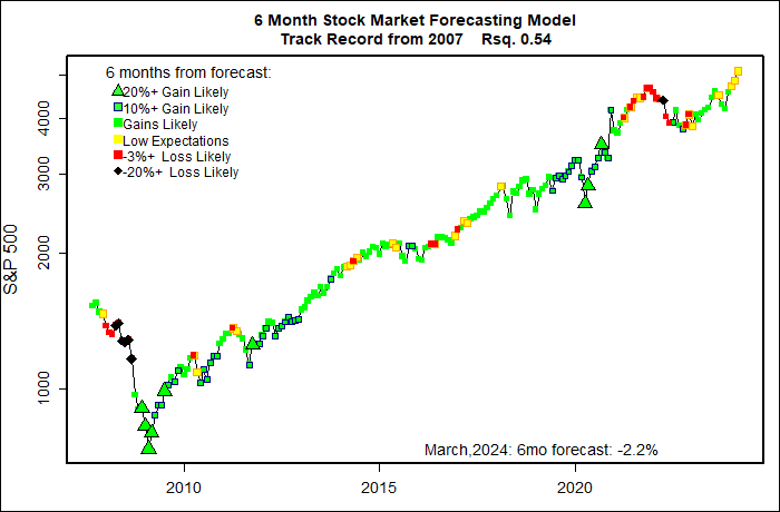
At the request of one of my few readers, I am bringing back my oldest and ugliest chart to illustrate. My wife calls it ‘garish’ and she is never wrong.

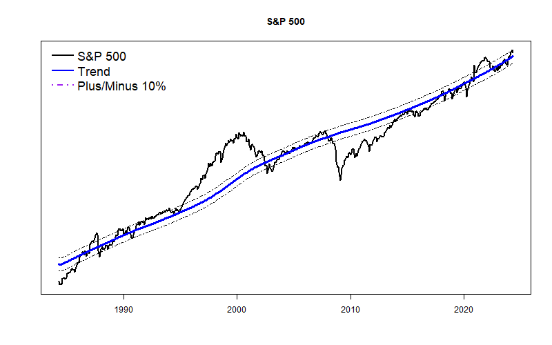
The graph below displays all of my actual 6-month market forecasts going back to 2007. The shape of the graph is the S&P 500 plotted on a logarithmic scale. Each dot is color-coded with the dot color indicating the approximate forecast value for the coming 6 months. (So, ideally a big market drop should follow a black diamond, and a strong market rise should follow a big green triangle.)

The message here is that the negative (red) forecasts of the past several months paint the wall of worry, just like they did through the pandemic mini-bubble. Eventually, they will probably prove to be approximately correct. At some point not too far away the market will probably be cheaper than is is today.

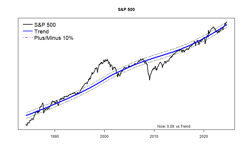
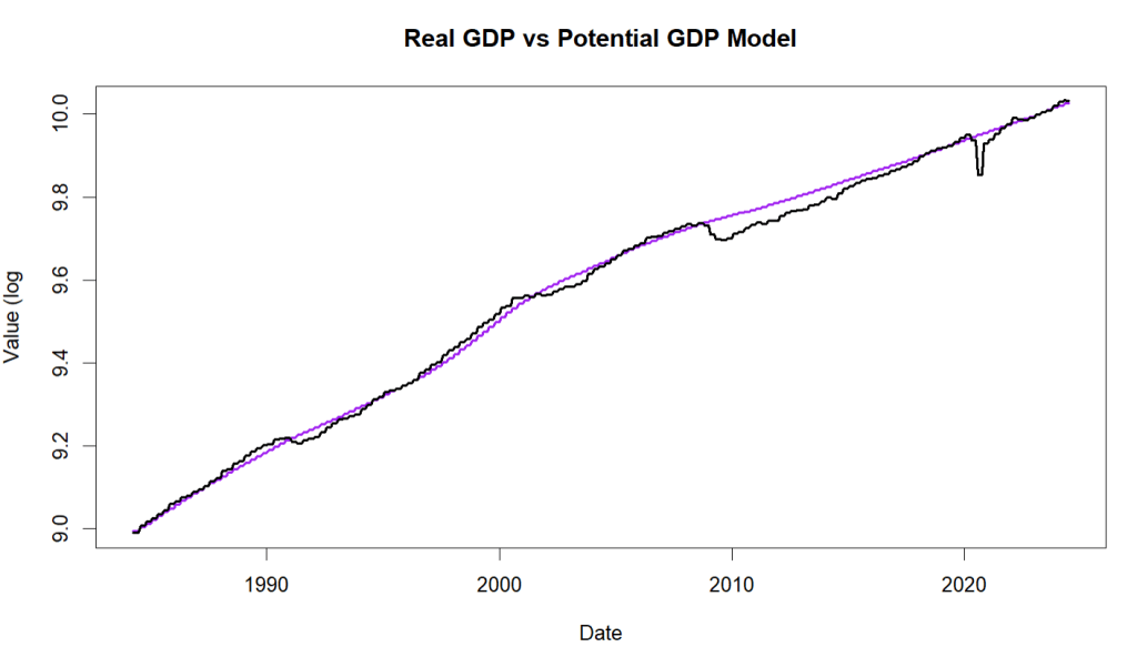
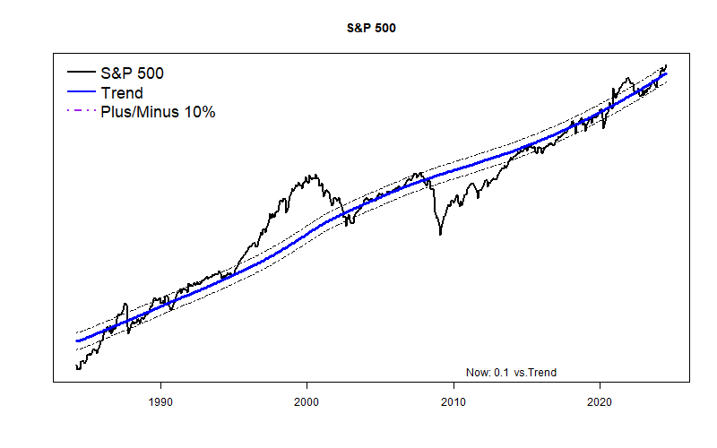
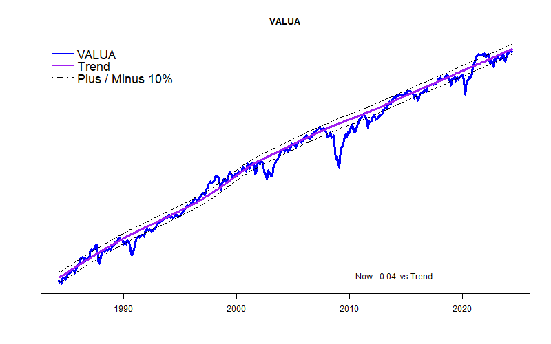
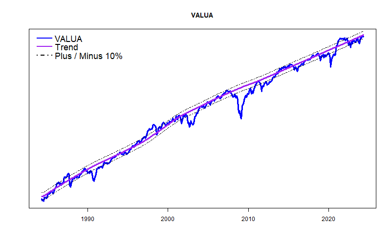
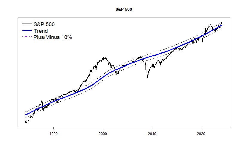
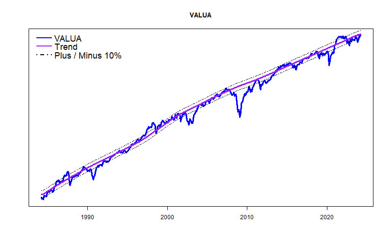
The plot (below) of a long-term model of the S&P 500 shows what certainly looks like the start of a new market bubble. Since at least 1871, the growth of U.S. GDP and the U.S. stock market have corresponded quite closely. That is no surprise: GDP tries to estimate the total volume of goods and services, while the S&P corresponds to a big chunk of that same economic output. The trend line here plots the current (and future) path of the S&P 500 based on the ongoing relationship between Real Potential GDP and long term interest rates. It is far from a perfect model, but it shows a growing divergence: a new bubble? (This model shows the S&P 10% above trend, another model says 14% above trend.)

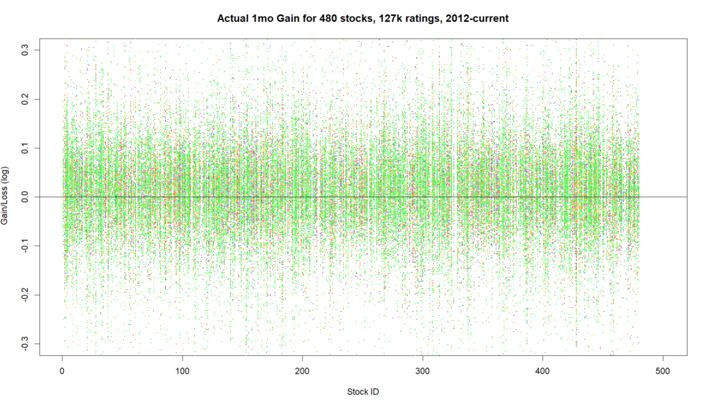
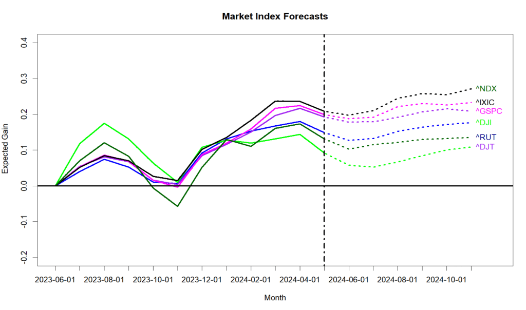
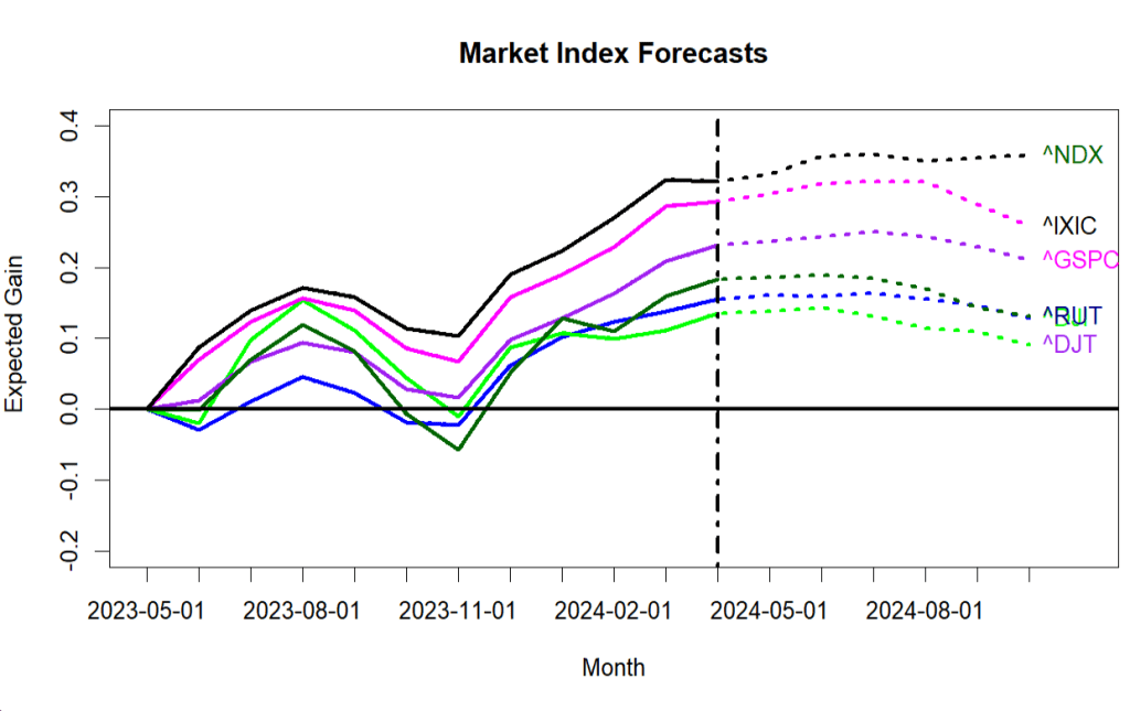
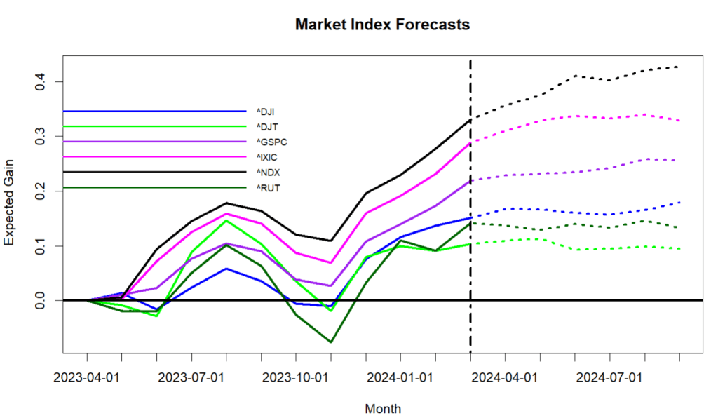
Here is a somewhat more positive look at a series of market index forecasts. The forecasts span from 1-week through 6-months. The models that produce these plots are based on gobs more data than my original models and are not quite as ‘fixated’ on the market crashes of the past. For good or ill, they are more trusting of current economic data.

If the Orange Octogenarian does something exceptionally bizarre in the next month, then all bets are off.

Shmanalysts!

(This is a boring digression and does not include stock forecasts.)

Over the past 2 years my stock market forecasting broadened its base to include vastly more data from a much broader set of sources. But, I have never included data from any ratings by established equity analysts. Thinking that maybe this was a terrible oversight, I now have taken a look at the possibility of including analyst ratings in my forecasting methodology. And found little of use.

With the cooperation of a friendly data broker I downloaded 127,000 distinct ratings produced by 303 rating companies from 2012 to the present concerning the 540 large capitalization stocks I now monitor.

A first caution flag in the data was that 50 analyst firms ended up with no score in my tabulations. Not all analysts use the same terminology, so by ‘Buy’, for example, I include: Buy, Strong-Buy, Highly Recommend, Outperform, Overweight, and Conviction Buy. Same story with variations on ‘Sell’. I lumped together ratings as best I could, but clearly I missed some, or just got confused. Afterall, what does “Peer Perform” mean? Even better term: Mixed! Either these firms with no final score were using quite different terminology, or else they produced very few actual ratings. This only amounts to skipping over a few percent of the ratings, and I don’t really care.

Along a similar line, nearly half of the rating firms had produced less that 5 reports for any of the firms I care about. Generally, these are well known rating firms, so they must just be busy with other stocks. Some of these onsie-twosie ratings were spectacularly accurate and some ended up being incredibly bad. For my purposes they did not have enough of a track record for me to evaluate. I included them in the tabulation anyway, but there is not much of an impact.

A second and larger red flag in the ratings was that there were approximately 18 times as many ‘Buy’ recommendations versus ‘Sell’ recommendations. Nearly a third of all firms issued zero ‘Sell’ alerts. One firm racked up 206 ‘Buy’ recommendations and zero ‘Sell’ calls. Hmmmm…

Overall, I wanted to see if ‘Buy’ or ‘Sell’ recommendations actually translated into stock price gains or losses. Nope.

I looked at the ratings for the 540 stocks at one-week, one-month, and three month durations, with price performance measured from the day BEFORE the rating was published.

The average results show no correlation. Neither a Buy or Sell recommendation meant anything on average.

DURATION Avg. BUY RESULT AVG. SELL RESULT

1-week performance 0.002 0.002

1-month performance 0.0108 0.0103

3-month performance 0.027 0 .030

I then plotted the 1-week, 1-month, and 3-month test results as shown below. The X-axis has a vertical line up for each stock. Up and down each vertical line are colored points. The Y height of a point reflects how much the stock moved up or down in the following week, month, quarter from when the rating was issued. The highest point would correspond to a gain of about 30%, while a low point would mean a price drop of about 30%. The color of the point indicates the nature of the rating: Green for Buy ratings and Red for Sell ratings. The other colors sprinkled in are for Hold or less common rating terms. The basic story is that green Buy ratings show little relationship to the resultant stock price rise or fall. The plots remind me of Christmas-time: lots of green combined with a random artistic sprinkling of red.

Several data vendors I had consulted acknowledged that a great bulk of analyst ratings were worthless, and for that reason they rate analysts and weight their recommendations in the process of developing ‘consensus’ ratings. So, I cut the data differently, scoring by rating firm rather than by stock. In the graph below, each vertical line corresponds to an individual rating firm. Some vertical lines for firms are nearly blank and some firms have hundreds of points. Green points again are Buy ratings and Red are Sell ratings. Height of each point again reflects how much that particular rated stock rose or fell. Just like the other graphs there is no obvious sign that some firms produce significantly more productive ratings than others. If you ever spot a large and reliable ratings firm, please send me a note!

September 2024 thru February 2025: Probably not too bad

OK, August turned out to be a bit more exciting than I had forecasted; the stock market flopped with a loud plop, down -7% at the start of the month. Stocks zoomed back up ,ending about 1% over where the month started.

Overall, as it has for months, the U.S. stock market continued to perform a bit better than my models have been expecting. And, that’s a good thing since the models are still mildly pessimistic. The basic economic situation is unchanged: the Federal Reserve is maintaining high interest rates with the goal of tamping down the economy. But, the U.S. Treasury is dumping new money into the economy through historically high deficit spending. Unemployment has crept up a bit. The housing sector has weakened a little. Corporate profits remain generally strong, and the probability of an actual recession stays fairly low. GDP is slightly above trend.

The Fed appears certain to change direction in September and to start lowering interest rates back down. The reality is that the Fed cannot cut rates much. The relentless Federal deficit will continue to push for inflation until at least next spring. Then, a new Congress and a new President will have no choice but to at least pretend to do something. I remain concerned for the stock market in late winter and early spring.

In the meantime the high flyers in the stock market have their backs against the “Wall of Worry”. New highs are occurring, and volatility will probably increase. The AI capital expenditure boom is real, and has further to run.

The S&P 500 is about 14% above its long-term trend line. That is a bit worrisome, and it could grow to become a bubble. The equal weighted Value Line Arithmetic Average is very near trend. Are we going to see something like the Dot Com Bubble as the next big market move? A populist President, a compliant Congress , and a castrated Federal Reserve could let it happen. That didn’t end well.

August 2024 thru January 2025: Another boring forecast with no guts!

Emotionally, I keep wanting to issue a big controversial stock market forecast, but the numbers just won’t let me. The forecast for the next month is essentially flat, and the estimates in the months that follow are bland. There is no end of scary/exciting news in politics and we have seen distinctly higher volatility on Wall Street. My forecasts don’t care much. As far as they are concerned, the Immaculate Disinflation is still on-track. Higher interest rates are slowly damping down the economy, squeezing out inflation. Unemployment has inched up, but the current 4.1% unemployment rate is none-the-less historically quite good. Large cap stock profits are still fine overall. Financial liquidity (M2) is pretty stable. GDP remains a bit higher than the best long-term models expected. Main street is still pretending that workers are going to come back and fill the near-empty downtown office buildings. It is all like watching paint dry.

The markets are playing along with the snooze-worthy scenario. The S&P 500 remains 9% above my long-term trend line. (No big deal.) The equal-weight Value Line Arithmetic Index is now a glorious 2% above its long-term trend, much improved from being a few points below trend. Be still, my heart!

If World War III doesn’t kick off in the meantime, my personal bet is that we will witness stock market fireworks in the late winter or early spring when a new Congress and new U.S. President will have no choice but to pretend to deal with the exploding Federal Deficit. (Scary picture at the end of this post. Well, I find it scary at least. The deficit truly is falling off a dangerous cliff.) They will try heartily to do absolutely nothing, but eventually will have to enact a tweak or two. In the process, the stock market will envision huge “what-if” gyrations if my guess is right.

July thru December 2024: Probably better than I forecast, but just muted gains.

Since November, the stock market has been performing somewhat better than these models have been forecasting. So, I wouldn’t be surprised if that positive over-achievement continues for a few more months, leading to fairly mild market gains overall. But, even my pessimistic models do not foresee anything really bad happening. The bad news should happen in 2025.

As I have written for months, the overall economy is performing well — actually it is performing slightly too well and that is the problem. The Federal Reserve feels forced to fight inflation by intentionally holding back the economy via high interest rates.

Actual Gross Domestic Product is running a bit higher than the long-term Real Potential GDP model run by the Congressional Budget Office. (See chart.) That is my personal definition of the famous “Wall of Worry”. Right now it much easier for the economy to quickly get worse than for the economy to sharply get much better. Looking at the graph, for years the actual GDP may run near or even slightly ahead of the GDP model. But, actual GDP seldom spurts high above the model, and typically the Wall of Worry period ends in some level of collapse.

The economy remains spurred by high Federal deficit spending, and simultaneously constrained by high interest rates — pressing simultaneously on the gas pedal and the brake. This may suddenly change next spring, but it will not change in the next few months.

The split continues to increase between a small number of high flying AI and tech stocks like Nvidia, versus the broader market reflected by the equal-weighted Value Line Arithmetic Average. At the moment the S&P 500 is 10% above my trend line and the Value Line Average is 5% below trend. All my models expect more of the same to come.

These models still have not learned how to read the news, so they are blessedly blind to the political world. Typically in the past, major movements in spending or interest rates lead to major lasting stock market movements. Political news, however, tends to produce sudden and sharp temporary stock price moves. Let’s hope that remains the case. (But, that is ‘hope’ speaking, not statistical experience.)

June thru Election 2024: Mixed and Mild Forecasts

In May the market indexes popped back up nicely — which my forecasts were not expecting. That’s why my musings are free. It is only sometimes that they are right.

The model forecasts for June are flat to down a point or two. For the next 6 months the forecasts are mildly positive the the NASDAQ Composite and NASDAQ 100, essentially flat for the S&P 500 and down a few points for the broader market averages.

The primary reason these statistical models for the past half year have been pessimistic stems from the Federal Reserve’s interest rate increases that started just about two years ago. At no point in the past several decades has the Fed increased rates as much or as quickly as this round. Short-term interest rates are now higher than long-term rates, a so-called “rate inversion”; and there never has been a rate inversion as deep or as long-lasting as the present one.

In every other instance of a rate inversion there has been a major stock market decline. Typically, the stock market decline happens fairly soon after the Fed starts to reduce rates again, usually in response to negative economic data.

This time may well be different and maybe that explains why the models have been overly pessimistic. Even while raising interest rates, the Federal Reserve sent trillions of dollars to banks to temporarily prop up their reserves (“reverse repos”). A major bank crisis was largely averted. The Fed also has slowed the rate at which they are reducing their bond portfolio, another positive. And, perhaps most importantly, Federal deficit spending remains incredibly high, effectively providing a major economic stimulus.

Before the U.S. elections any significant Federal Reserve actions or Federal Government spending changes seem highly unlikely. Come the New Year, the picture will be entirely different as the Trump era income tax cuts are due to expire. At the very least, investor fears will skyrocket. But, that’s not now. For now the relevant economic news is not too bad.

Looking at the long-term trend lines, the S&P 500 is about 8% above the long term trend and the Value Line Arithmetic Average is 4% below trend.

May thru October 2024: OK, the market dropped a little faster than the forecasts predicted.

Last month these forecasts expected “the primary market indexes to pause and then retrace a bit”. Well, they did, but I grant that they went down more than a tiny bit. Anyway, the current forecasts expect the downward trend to continue for the next month or two. Nothing really major, but highly likely the market will drop some more. (Why? The equations say to blame the 1/2% increase in the 10-year Treasury rate.)

Last month the forecast for the S&P 500 was less than 1/2 of one percent positive. (Sub-Meh) But, it was POSITIVE, and for the last several months the market has been behaving above expectations. Now the tide has shifted and all the major indexes have projected 1-month losses of -1% to -3%. Does not look horribly bad, but the immediate expectation is now negative, and for the broader market the 6 month forecast is negative. The old adage “Sell in May…” looks like a winner this year.

I have a new graph to unveil. Of the 600+ large-cap stocks I follow, I keep score of the number that have strong positive 1-month forecasts versus the number with strong negative 1-month forecasts. This next graph shows the “bouncing-ball” output. The blue line is the net positive/negative score and the red line plots what actually happened to the S&P 500 for these months. (Ignore the last red month, it hasn’t happened yet.) Anyway, the net forecast is for a negative period that plays out something like last October-November.

Otherwise, nothing is seriously wrong with the stock market. The S&P 500 is bouncing along its normal boundary, busily deciding if it wants to begin a new and wonderful “AI Bubble”. (My hunch is that it will.) The more staid VALUE LINE Arithmetic Average is right at its long term trend line.

April thru September 2024: Market Slowly Easing Off

The U.S. stock market has performed spectacularly well since October, so not surprisingly, my short term market forecasts expect the primary market indexes to pause and then retrace a bit. The NASDAQ 100 is projected to have a gain of about 1% this month, while the other indexes are expected to gain a mere 1/2 percent or less.

Changes in the economy are the prime drivers of these models, and not much change is expected soon. Unemployment is low and job creation is high. Corporate profits remain strong. Inflation is relatively tame and not rising. Interest rates are elevated, but compared to everything over the past half century, they are not all that bad. Gross Domestic Product numbers are right at the level of the “full employment” Real Potential GDP model of the Congressional Budget office — that is wonderful, but it does not leave much room for near-term improvement. While the threat of recession had been quite high just a few months ago, none of the data sources I tap now see much chance of recession in the next few months. And, quite thankfully the Republicans in Congress seem less eager to crash the Federal Government budget. At least for now.

The charts above show the S&P 500 currently a bit high compared to its long-term trend line, and the equal-weight Value Line Arithmetic Average is almost exactly at trend.

March thru August 2024: Split market?

The stock market has been on a tear since late October with the high-tech stocks of “The Magnificent Seven” taking the lead. The forecasts here see the technology stocks of the NASDAQ (^IXIC) and NASDAQ 100 (^NDX) sailing on for a few more months. However, more diverse stocks in the market like the Russell 2000 (^RUT) and the ValueLine Arithmetic Index are likely to peak, then falter after a few months. The overall prospect is that 6 months from now the probability of gain for the overall market is only about 55%. (Normally the market rises about 75% of the time over 6-month periods.) The S&P 500 is expected to fall a slight 2% in the summer months.

But, that is the future. March 2024 remains promising.

The long-term trend line of the S&P 500 shows it to be about 10% above trend. Too early to say if it bubbles up more or retreats.

VALUA is almost exactly at trend.

Overall, it looks like it is nearly time to start paying attention to the long term path of the stock market.

February thru July 2024: Soft Landing Continues

As the spaghetti chart below shows, my forecasts for most market indexes remain mildly positive. Technology stocks such as the NASDAQ 100 (^NDX) should stay in the lead while smaller stocks of the broader Russell 2000 (^RUT) are expected to bring up the rear. Looking out 6 months, the prospects are not as bright — probabilities of gain are looking weakish and the 6-month forecast for the Value Line Arithmetic Average is expected to drop by about a percent.

This calm forecast is striking evidence of the economy coming in for a soft landing following the Federal Reserve’s strong anti-inflation campaign. This is normally the point in the economic cycle when the stock market crashes. The high unemployment and corporate profit destruction that usually follows major interest rate increases simply have not happened — a so-called “Immaculate Disinflation”.

The growing split between the high-flying technology stocks and the main economy also shows up in my long-term trend plots of the S&P 500 and the Value Line Arithmetic Average. The S&P now appears to be distinctly higher than normal while VALUA is showing weakness. Neither of these trend divergences, however, seems to be concerning. Yet.

Hopefully, the Alpha Test of ETF forecasts concludes this month, and next month it can transition to a somewhat more credible Beta Test. The 6 month ETF forecasts are proving to be mathematically fairly accurate. The 1 and 2-month forecasts are not showing high accuracy, but they certainly are much better than any of the fruit of “Technical Analysis”.