(Spoiler alert: scary chart below.)
I have been working to add a quantitative measure of risk exposure to my stock market overview material. There are numerous ways to quantify risk, and I am trying to come up with some sort of composite indicator that includes the full spectrum of “make you want to puke” factors: excessive market valuation, financial instability, geopolitical disruption, political instability, Equity Risk Premium (stock rate of return versus risk free interest return), Things That Go Bump in the Night.
There are plenty of risk measures to choose from and most (except financial instability) are at dangerous levels right now. Using most any of these measures, if market prices were to get back to “normal” (whatever that is) then the stock market could quickly plop down 30% to 50%. If a couple of things went bad at the same time, things could quickly get even worse. Stomach shaky yet?
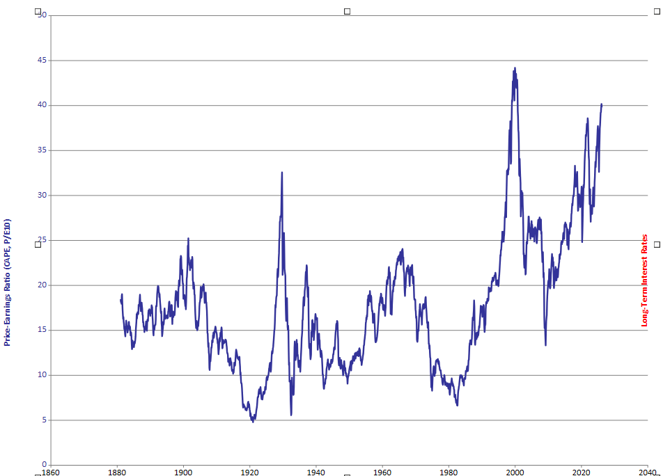
Anyway, as part of this quest I revisited the data set that Robert Shiller used for his 2000 blockbuster book Irrational Exuberance. He had incredible timing; the book was published just as the horrific Dot Com market crash began. Since publishing, he and Yale University have maintained and updated the data set here . It is a wonderful resource as it has numbers going back all the way to 1871.
Stock pricing is supposedly rational, so it would be reasonable to figure that the general ratio of stock price to company earnings (P/E) would be somewhat constant, or at least it would sort of follow long-term interest rates. It makes sense that it should appear even more smooth with averaging. Shiller’s CAPE P/E measure has a 10-year earnings average to filter out the noise. But even with that decade-long ‘smoother,’ the P/E path is anything BUT smooth.
Here is what I see in the chart; P/E, rather than being steady, follows a kind of rough pattern every few decades. After a severe stock market crash, P/E stabilizes for a while, but then begins an exponential, increasingly rapid, climb. Finally, when that rate of climb ‘turns vertical’, a severe market crash happens. Since 1871 I don’t see any cases of a fast rising P/E climb that smoothly leveled off. Maybe the 1960’s qualify as a P/E leveling, but that amounted in a lost decade for stocks. Yay! Pick your poison.
Right now, P/E is incredibly high and spiking vertically. As the Great Crash of 1929 hit, the CAPE ratio was nowhere near as high as today. The only other time CAPE has climbed this high was also in a spike, December, 1999. The great Dot Com stock market crash began four months later (March, 2000) and hit bottom in 2002 with a total fall of 49%.
I have no Idea if we are on the verge of a similar collapse, or when it might happen. But , I do not like the current P/E spike. It might it might be time to proceed with caution and pay close attention.