(This is a boring digression and does not include stock forecasts.)
Over the past 2 years my stock market forecasting broadened its base to include vastly more data from a much broader set of sources. But, I have never included data from any ratings by established equity analysts. Thinking that maybe this was a terrible oversight, I now have taken a look at the possibility of including analyst ratings in my forecasting methodology. And found little of use.
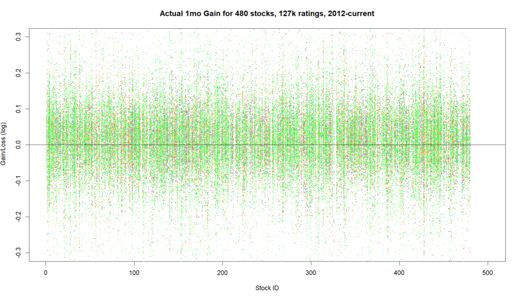
With the cooperation of a friendly data broker I downloaded 127,000 distinct ratings produced by 303 rating companies from 2012 to the present concerning the 540 large capitalization stocks I now monitor.
A first caution flag in the data was that 50 analyst firms ended up with no score in my tabulations. Not all analysts use the same terminology, so by ‘Buy’, for example, I include: Buy, Strong-Buy, Highly Recommend, Outperform, Overweight, and Conviction Buy. Same story with variations on ‘Sell’. I lumped together ratings as best I could, but clearly I missed some, or just got confused. Afterall, what does “Peer Perform” mean? Even better term: Mixed! Either these firms with no final score were using quite different terminology, or else they produced very few actual ratings. This only amounts to skipping over a few percent of the ratings, and I don’t really care.
Along a similar line, nearly half of the rating firms had produced less that 5 reports for any of the firms I care about. Generally, these are well known rating firms, so they must just be busy with other stocks. Some of these onsie-twosie ratings were spectacularly accurate and some ended up being incredibly bad. For my purposes they did not have enough of a track record for me to evaluate. I included them in the tabulation anyway, but there is not much of an impact.
A second and larger red flag in the ratings was that there were approximately 18 times as many ‘Buy’ recommendations versus ‘Sell’ recommendations. Nearly a third of all firms issued zero ‘Sell’ alerts. One firm racked up 206 ‘Buy’ recommendations and zero ‘Sell’ calls. Hmmmm…
Overall, I wanted to see if ‘Buy’ or ‘Sell’ recommendations actually translated into stock price gains or losses. Nope.
I looked at the ratings for the 540 stocks at one-week, one-month, and three month durations, with price performance measured from the day BEFORE the rating was published.
The average results show no correlation. Neither a Buy or Sell recommendation meant anything on average.
DURATION Avg. BUY RESULT AVG. SELL RESULT
1-week performance 0.002 0.002
1-month performance 0.0108 0.0103
3-month performance 0.027 0 .030
I then plotted the 1-week, 1-month, and 3-month test results as shown below. The X-axis has a vertical line up for each stock. Up and down each vertical line are colored points. The Y height of a point reflects how much the stock moved up or down in the following week, month, quarter from when the rating was issued. The highest point would correspond to a gain of about 30%, while a low point would mean a price drop of about 30%. The color of the point indicates the nature of the rating: Green for Buy ratings and Red for Sell ratings. The other colors sprinkled in are for Hold or less common rating terms. The basic story is that green Buy ratings show little relationship to the resultant stock price rise or fall. The plots remind me of Christmas-time: lots of green combined with a random artistic sprinkling of red.


Several data vendors I had consulted acknowledged that a great bulk of analyst ratings were worthless, and for that reason they rate analysts and weight their recommendations in the process of developing ‘consensus’ ratings. So, I cut the data differently, scoring by rating firm rather than by stock. In the graph below, each vertical line corresponds to an individual rating firm. Some vertical lines for firms are nearly blank and some firms have hundreds of points. Green points again are Buy ratings and Red are Sell ratings. Height of each point again reflects how much that particular rated stock rose or fell. Just like the other graphs there is no obvious sign that some firms produce significantly more productive ratings than others. If you ever spot a large and reliable ratings firm, please send me a note!

