Feel free to ignore this post. It does not include a new forecast and is horribly boring. Enjoy an eggnog instead.
We may be near a major turn in investor psychology.
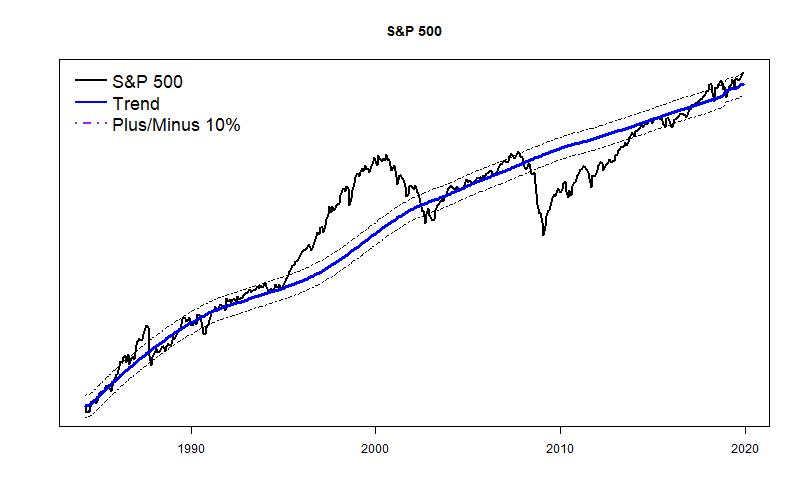
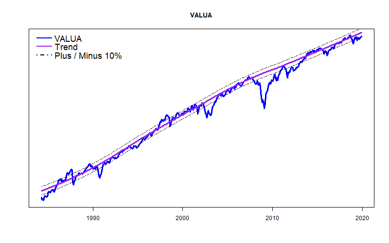
The S&P 500 average is currently about 10% above its very long term trend line. The Value Line Arithmetic Average, my favorite market index, is roughly 10% below its own long term trend line. I have started plotting the divergence of these indexes, and it appears to show long term shifts in investor optimism. I will start posting monthly updates of this graph of index divergence. Don’t hold your breath, but things might start to get interesting over the coming year.
What Divergence?
Nearly every month I post multiyear graphs of the S&P 500 and VALUA along with each of their long term trend lines. The trend lines are described in detail under the tab “Long Term Model” at the top of the blog. For convenience, along with the actual long term trend I include dotted lines showing 10% above and below the trend line.
The market trend lines I calculate are not like the moving average trends you will see on most stock price graphs. As a quick overview, my trend lines are based on very long economic expectations: long term business growth, Real Potential GDP, and smoothed interest rates on 10-year Treasury Bonds. Whatever the stock market has been doing over the past few years has nothing to do with where the trend line heads. Except for when the stock market goes crazy, the actual VALUA values have stayed remarkably close to the long term trend expectations. The S&P 500 does not stay as close to its long term trend, and therein is the source of a divergence.
Generally speaking, nearly all stock market indexes go up and down together — hour-by-hour, day-by-day, and month-by-month. But…
Divergence may follow a pattern.
A remarkably steady multiyear shift occurs in the relative performance of the S&P 500 and VALUA. The graph below shows the summed divergence of the S&P 500 and VALUA from their respective trend lines. As I wrote above, the S&P 500 is now about 10% above its long term trend while VALUA is about 10% below its long term trend; these combine to a total 20% divergence.
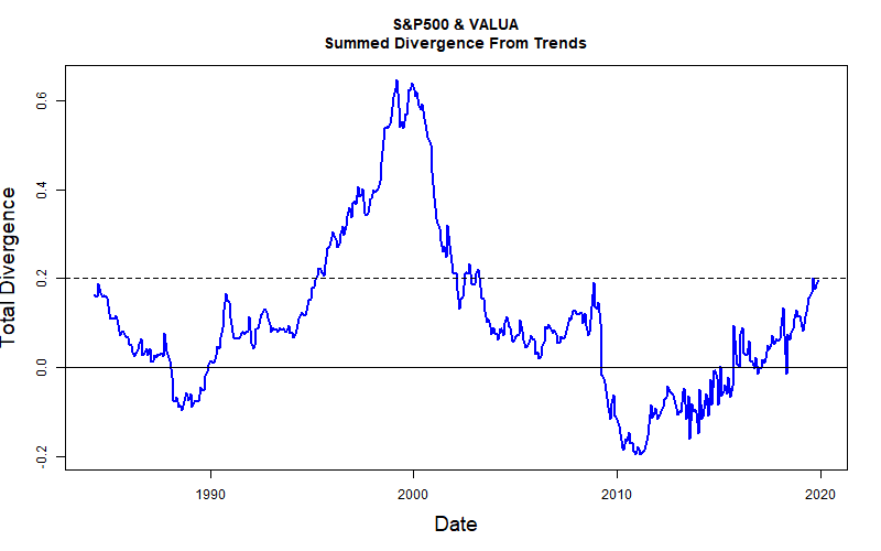
Here is how I view this 35 year graph. Although there is plenty of seemingly-random variation month-by-month, there are also surprisingly steady long term trends going on over periods as long as a decade. The big spike in the center of the graph is the story of the Dot-Com bubble. From the mid-1990’s to 2000 the S&P 500 performed vastly better than VALUA. It was a truly incredible bubble! The S&P 500 was flying way, way above its long term trend line. The broad market, as represented by VALUA really did not experience the full extent of the bubble. VALUA maxed at about 10% above trend.
By way of comparison, the period 2006-2009 leading up to the crash of the Great Recession did not show the same degree of stock market speculation as the Dot-Com fiasco. All the crazy financial action took place in the world of real estate speculation, not the stock market. None the less, during the years leading up to the 2008 crash, the S&P 500 was performing better and better than the plodding VALUA. In 2008, the divergence peaked at about 20%. (Just like today’s level.) And then the market crashed.
At the pit of the crash, both the S&P 500 and VALUA were far below their long term trend lines, but the S&P 500 was in much worse shape. It took about half a decade of recovery for the S&P 500 relative performance to match that of VALUA.
Today?
The current 20% total divergence between the two indexes may or may not be near some sort of critical level. But, it is enough of a divergence to cause me to start to fret.
Based on all of the federal government stimulus (tax cuts, trillion dollar deficit, increasing money supply, low interest rates, FED bond buying), my best guess is that a stock market melt-up will continue to develop, causing the divergence to shoot up. The S&P 500 will probably far exceed VALUA gains. A melt-up of stock market prices would be well worth enjoying.
But, if divergence shoots up, we will have good reason to worry about a stock market crash happening sooner, rather than later. Maybe we can watch that setting up
