(This post does not contain a new market forecast.)
In brief: Over the span of decades the basic nature of the stock market can change somewhat, and sometimes the stock market “goes off the rails”, Accepting these two major characteristics can help to better understand the long term market trend.
The goal of this series of posts is to explain a new, ‘intelligent’ stock market trend line that I will be including in my monthly stock market forecasts. By ‘intelligent’, I mean that it is focused on where the market ‘should’ be heading based on its long standing relationship with the economy. The new trend line is not just a simple extension of the current trend of recent stock market behavior.
Trusting in simplistic trend lines can lead to disaster — that’s part of my story.
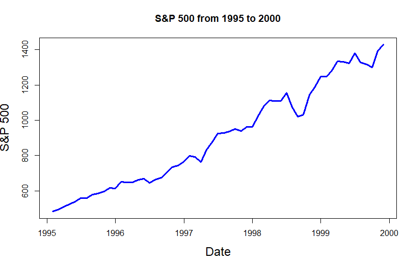
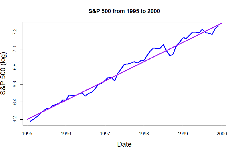
I got burnt badly during the DotCom Bubble. During the 1990’s the graph below shows how I saw the stock market — one great big ascending curve of market expansion as the U.S. economy shot up, powered largely by computer technology. The great upward trend was so obvious! I was a computer jock, and that time was exhilarating!. This time was different!
There wasn’t much free public electronic economic data available then, and the stock data that was available didn’t go back very far in time. I knew enough to plot growth with a percent gain (logarithmic) Y-axis, and that immediately straightened out the market growth curve, revealing an amazing steady straight line of growth.
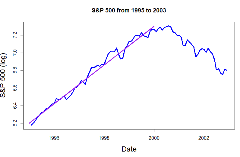
All things tend to follow a trend. Until they don’t.
So, when the stock market eventually turned down, I foolishly trusted the well-established market trend that I had been following for years. I didn’t sell much stock as the market fell. When I did sell during the worst days of the market crash, it turned out to be near the bottom that eventually formed.
Now and then the market actually does change.
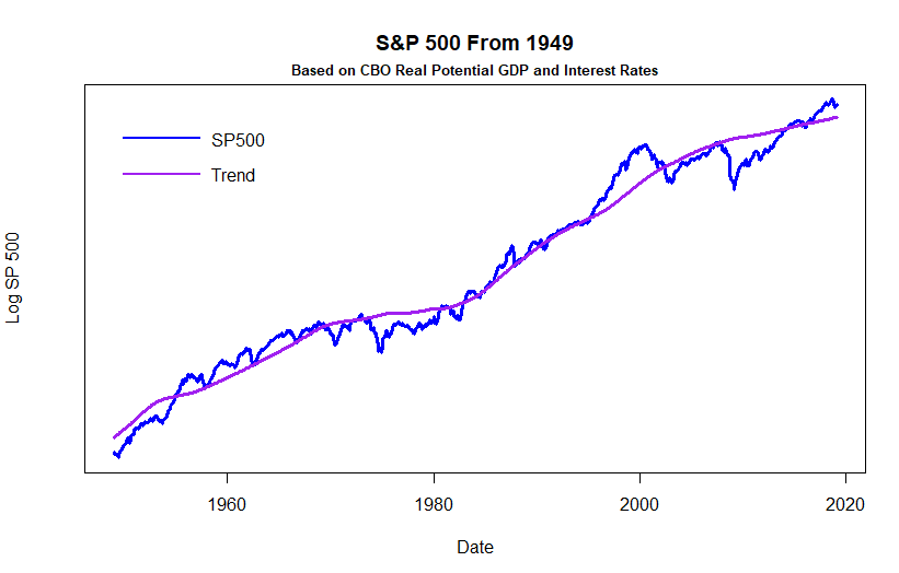
The simple trend line I established in the first two parts of this series is based on just the fairly steady growth of the economy and on fairly long term shifts in interest rates. The trend matches the long term path of the stock market fairly well as shown in the graph below. The most noticeable characteristic of the trend line is that it did mimic the flattening of stock market growth during the 1970’s that largely resulted from tremendous increases in interest rates.
But, the simple trend does not fit with some factors we know for certain about the stock market. From the 1970’s to early 1990’s a couple of huge factors did change with the stock market, changes that had little to do with shifts in Gross Domestic Product or with interest rates. From the early 1980’s the stock market started rising at a greater pace than it had in earlier years. And there were reasons for that change.
An immediate example of a non-GDP shift in the stock market is that since 1980 it has become easier and easier to buy and sell stock. Prior to the birth of discount brokers it was common to pay hundreds of dollars as a commission for buying shares of stock. Now, the same transaction would cost a few dollars at most. Also, formerly, individual investors would end up buying mutual funds from major brokerage funds the had steep fees (loads) of up to 8 % for buying and or selling. Now, most discount brokers will sell no-load stock funds with nearly insigniticant management fees.
Overall, there are more reasons for people to own stock. The creation of Individual Retirement Accounts, 401k plans and similar savings vehicles have meant that for many millions of people that they can hold stock, even for decades, and not pay any tax until they eventually cash out their stock. Aging of Baby Boomers has greatly accentuated this trend in recent years.
Capital gains taxes on the sale of stocks are only paid when stock is sold, unlike dividends which are taxed in the year they are received. Also, capital gain tax rates have generally been less than taxes on dividends. Both of these factors made it much more attractive to hold stocks for capital gains rather than for dividends. Most recently, major corporations have seized on this to enhance their desirability by putting most of their profits into stock buy-backs — buying their own shares, thereby decreasing the number of shares on the market and increasing the earnings per share of their stock. Many corporations have taken this a step further — taking advantage of recent incredibly low interest rates they have borrowed incredible sums of capital and used that money to buy back even more shares.
These shifts away from dividends and expansion of stock buy backs have boosted stock prices, but they have little direct effect on GDP or interest rates. So, my existing trend line is oblivious to them.
Over time major corporations — the components of the stock market — have accounted for an increasing share of GDP. But, the last few decades have seen a much higher rate of the corporate share of GDP. My long term model does not recognize this shift.
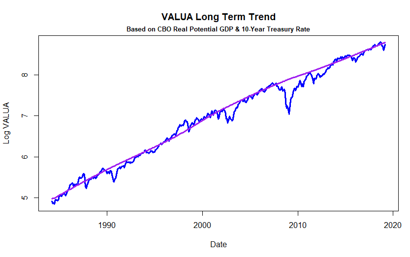
Changing my trend model to account for these changes in the nature of the stock market ends up being quite simple — I am only going to base the final model parameters on stock market behavior since the mid-1980’s when all of this got underway.
There is a price to this, of course. My model will not match data for earlier years as accurately. But, I don’t care. My goal is not to perfectly model the stock market from day one. I just want to be able to detect when today’s major market trends change. Concentrating on changes in just the past 3-4 decades will accomplish my goals easily.
And then, sometimes the stock market just goes crazy.
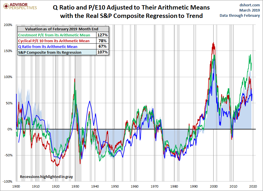
The chart below comes from AdvisorPerspectives.com It tells the long term story we are all too familiar with — somewhat cyclically, the stock market goes through booms and busts. We change how we value stocks. Prices (and Price/Earnings Ratios) rise to a peak and then crash. Some of this rise and fall is explained through major cycles in interest rates. But, some stock market craziness is just craziness.
Generally, we do not recognize a developing stock market bubble until it deflates. We thought “This time it’s different!”. And it wasn’t. Time and time again.
So, how can the intelligent trend line deal with these boom/bust cycles? During our recent past we have had an incredible stock market boom — the Dot Com Bubble. And we had two major financial catastrophies — the Savings and Loan Crisis of the later 1980’s and the Great Recession of a decade ago. How can the intelligent trend line avoid being shaped by these huge events?
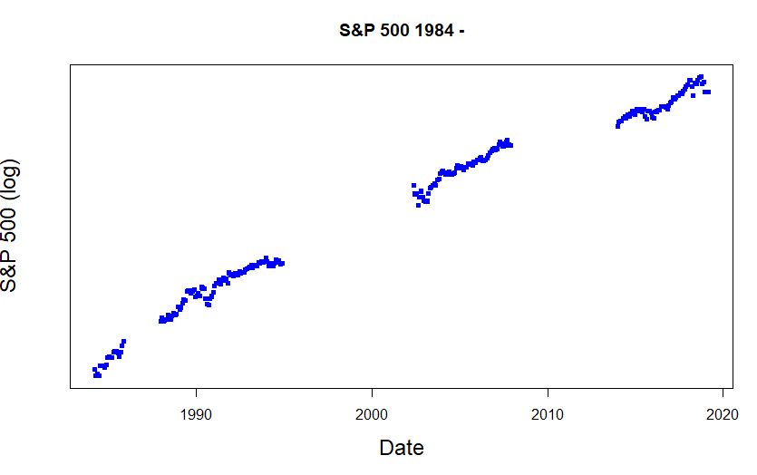
Most of the time, the stock market behaves fairly rationally, and then some times it does not. So, in the final definition of the trend line model I will take the crazy times out of the modeling process. The graph below shows the S&P 500 from 1984, but data for the dates during the major market crises have simply been removed.
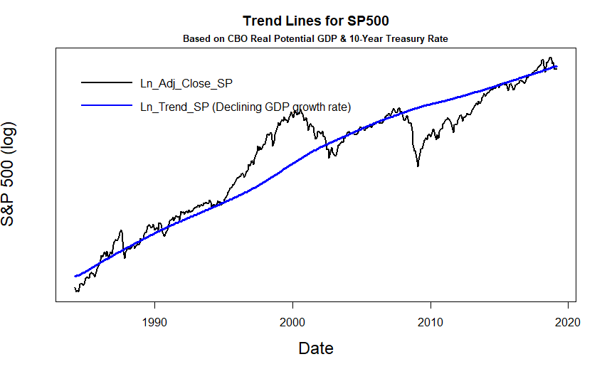
The next graph shows the final trend line for the S&P 500, based on long term GDP, smoothed interest rates, and ignoring proven market bubbles and crashes.
“Bait and Switch” Time!
Through this series I have shown the development of what I consider to be an intelligent trend line for the S&P 500 index. We will see over time how it performs.
But, the truth is: the S&P 500 is not the best index to use in following the stock market. The problem with the S&P 500 goes back to how it is calculated. These are, essentially, the 500 largest corporations in the country, but each is weighted according to its total market valuation: take the total number of shares and multiply by the price per share. That is the market capitalization. Using this weighting some companies like Apple, Amazon, and Facebook become much more important than other companies. During a stock market boom, the current hot stocks shoot up in price, but also take over an increasingly large role in computing the average. This reliance on current hot favorites makes the S&P 500 (and more so the NASDAQ Composite) prone to accentuating market booms and busts.
I prefer to use a different index, the Value Line Arithmetic Index. It also covers a larger number of companies (roughly 1,700) but each company is weighted the same. An index ETF you can buy that is very similar is the Guggenheim S&P 500 Equal Weight ETF (Symbol:RSP).
The advantage of using the Value Line Arithmetic Index (VALUA) for my trend line is simply that it is more predictable. Much less heavy-handed editing is necessary in order to escape from being distorted by market booms and busts. The final trend line for VALUA that I will concentrate on in my monthly forecasts is shown below. We will see how it performs over time.