(Feel free to ignore this post. It does not offer any current stock market forecasts.)
Pretty soon I’ll be posting what I consider to be an “intelligent” trend line for the stock market and make it a regular part of my monthly market forecast. What makes the new trend line “intelligent”? Well, it is based on where the market is most probably heading based on very long term economic data. Why does the trend line need to be so smart? Major structural changes that I can’t ignore are underway in the U.S. and world economy. All of this is going to take a few posts to explain.
Increasingly Increasing Growth
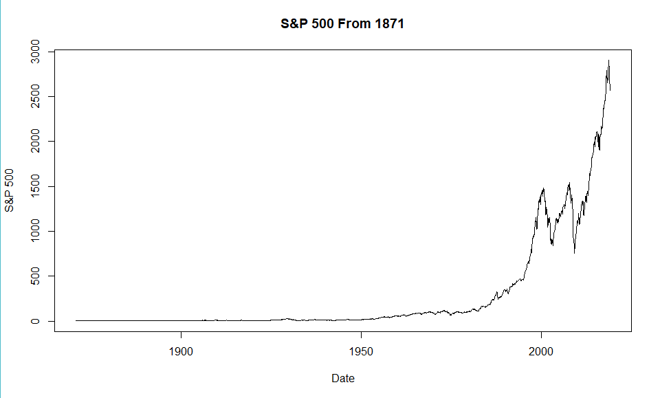
The S&P 500 is probably the most widely followed stock market index. It is a capitalization-weighted index reflecting the combined stock prices of most really gigantic American corporations. (i.e. Huge companies have a much greater impact on the S&P 500 than do merely big companies.) In 1923 the “Composite Index” had just a few stocks, by 1927 it had 90 companies, but it was not until 1957 that it included 500 companies. Robert Shiller (“Irrational Exuberance”) has posted extrapolated S&P data going back to 1871 that is the basis of my charts below.
The first graph shows the value of the S&P 500 from 1871 to the present. It shows the classic upward swoosh that characterizes exponential (compounded) growth of a few percentage points each year. But, a first glance it appears odd — like the market did almost nothing for about a century, then started an increasingly steep climb — almost straight up! What about the two crazy bubbles recently ( the DotCom Bubble and the real estate bubble that led to the Great Recession)? Where is the Great Crash of 1929? Not even visible.
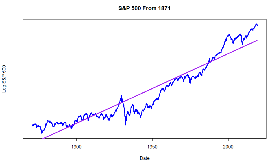
Plotting the logarithm of the price makes the graph show percentage growth rather than nominal growth.. A steady rate of price increase will show as a straight line (purple). ‘Bumps’ or ‘pot holes’ along the way match the percentage change of each market episode. So, this next chart shows the same data for the S&P 500, but the Y-axis now measures percentage change. The plot looks a bit straighter, and the huge spike and crash of 1929 is now clear. But, to my eye, it still looks like the curve has an upward swoosh.
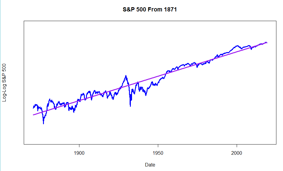
Turns out, the S&P 500 hasn’t just been increasing at roughly a set rate. Instead the rate of increase has been increasing at a somewhat steady pace! That’s the story of this next chart. The Y-axis now shows the the logarithm of the logarithm of the SP 500. (Sorry math-o-phobics!) And the straight ling approximation now looks pretty good. (R-squared = 0.95) So what? The world is about to go through a couple of huge changes in the next few decades. They are already starting to affect the stock market.
First the good news. We live in the developed world. The stock market is totally a creature of that developed world. Here’s the shocker: today only about 1/6 of the world’s population lives in developed world conditions. The rest of the world is about to play catch-up, much like China has been doing for the past few decades. The next two or three decades are very likely to see an explosion of world development and hence further explosive growth of the stock market. So, the positive angle is that any sort of ‘intelligent’ stock market trend line needs to be acutely aware of this coming world development. Most of the growth will occur outside the U.S., but U.S. multinational companies will undoubtedly catch a big share of the coming world growth.
Now the bad news. Rapid world development is already causing huge problems. Everyone is not benefiting equally. Huge numbers of people in the U.S. and all over the world already feel left behind. That is part of the Trump revolution. But, it is also part of many other phenomena like massive migration happening all over the world.
And there is another big risk hanging around.
I vividly remember the very first time I saw a long term exponential growth curve. I was 12 years old. It scared the hell out of me and I still remember it vividly.
It was the very first day of my seventh grade science class in 1959. Mr. Abrams, the teacher, projected a view-graph on the screen that had this great big upward swoosh. He said that this was a developing world problem that wasn’t causing big problems yet, but someday it would.
The graph was of carbon dioxide levels in the atmosphere.
Carbon dioxide levels have, of course, continued to double and double — at an increasingly increasing rate. World emissions are roughly 700% higher than they were when I was in seventh grade.
Today, it is still possible, perhaps, to debate that meaningful climate change has occurred. But, it won’t be possible to debate the effects much longer.
We in the developed world use several times more fossil fuels per person than people in developing countries. If the developing world starts to use fossil fuels like we do, then carbon dioxide levels will explode higher. Given the momentum of world development, much of this rise in carbon dioxide over the next few decades is essentially guaranteed.
So, any ‘intelligent’ trend line for the stock market needs to be closely attuned to these huge world changes. We need to closely watch what is happening.
Fortunately, several hundred economists have helped me in creating my new trend line. But, that story is for another post.

