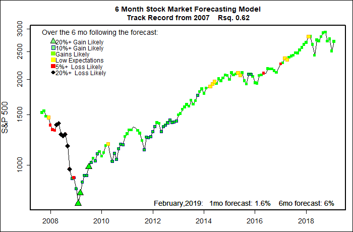
The statistical forecasting model says:
February, 2019: +1.3% (Above average)
Next 6 Months: +6% (Somewhat above average)
Probability of at least breaking even: Different models, different outputs
My models expect the current market rebound to continue, but not as any sort of huge bull market rush. The tools I use to estimate a probability of breaking even over the next six months give conflicting readings. My guess is we should expect fairly high market volatility to continue.
Every couple of years I make small adjustments to my forecasting models. Based on a decade of forecasting experience, the economic data and indicators that actually point to future stock market moves really do not change very much. But, they do shift a little, leading me to tweak my models just a bit.
It is hugely encouraging that the leading indicators I started using a decade ago still do a pretty good job of forecasting major moves of the U.S. stock market. It is easy to take a bunch of economic data and hammer it into a mathematical model that matches a stretch of past market action. That does not mean a forced model will give solid forecasts in the future.
In a paper published two decades ago, mathematician David Leinweber and portfolio manager Dave Krider demonstrated the foibles of data crunching by showing that butter production in Bangladesh had the tightest correlation to the S&P 500 of any data series they could find at that time. Combining that with U.S. cheese production and the number of sheep in Bangladesh their three-variable model “explained” 99% of the S&P 500’s movements. Correlation is not causation.
Anyway, in reviewing my forecasting models I have been looking a lot at interest rates. More than most any other factor, rapid shifts in interest rates have a major impact on the stock market. Raise interest rates quickly enough and even the strongest business will be in financial distress.
In particular, I have been looking at interest rate spreads — differences in rates for short term loans versus long term loans. Normally a short term loan for, say, 90 days will have a much lower interest rate than a long term loan or bond, like a 10- year bond. The argument is that a lot can happen (like rising inflation) over several years that could destroy the value of the long term loan.
Sometimes, however, short term rates can be higher than long term rates. This “inversion” of the normal pattern is usually a signal of a coming economic recession, and is generally very bad news for stocks.
Sure, it’s a boring topic, but fear of a an imminent interest rate inversion was the main force driving the panic selling between October and December, and the fairly spectacular market rebound in January.
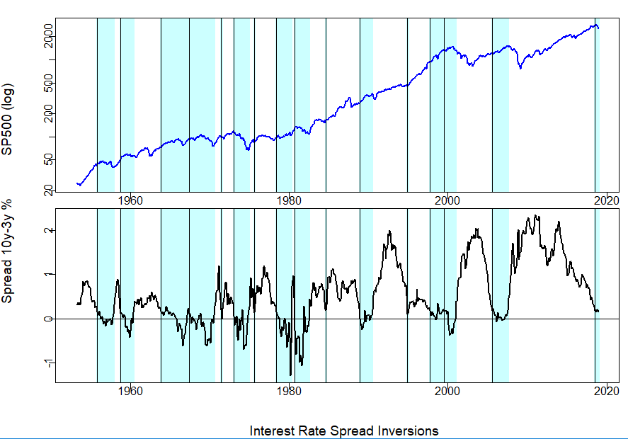
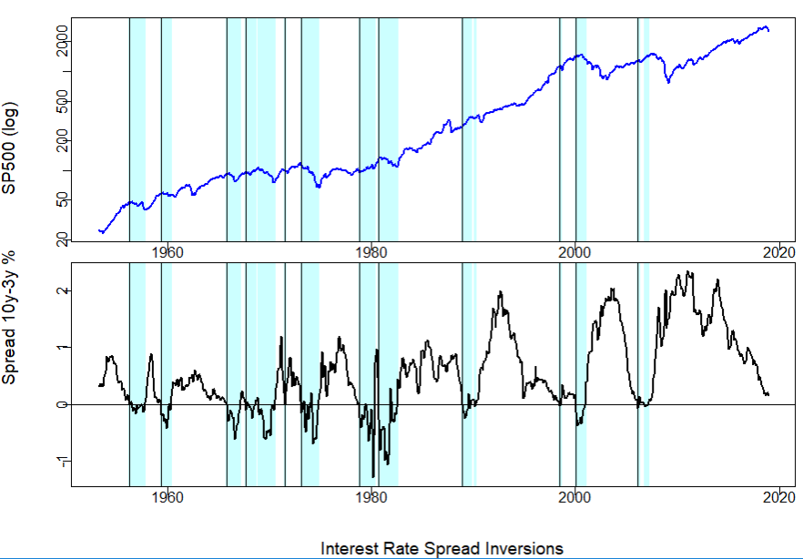
The two charts below show the S&P 500 (top graph) and the spread between the 10-year and 3-year U.S. Treasury bonds since 1953. The vertical black lines flag where the interest rate spread hit zero. It is not a perfect match, but following the rate inversions the market often tanked.
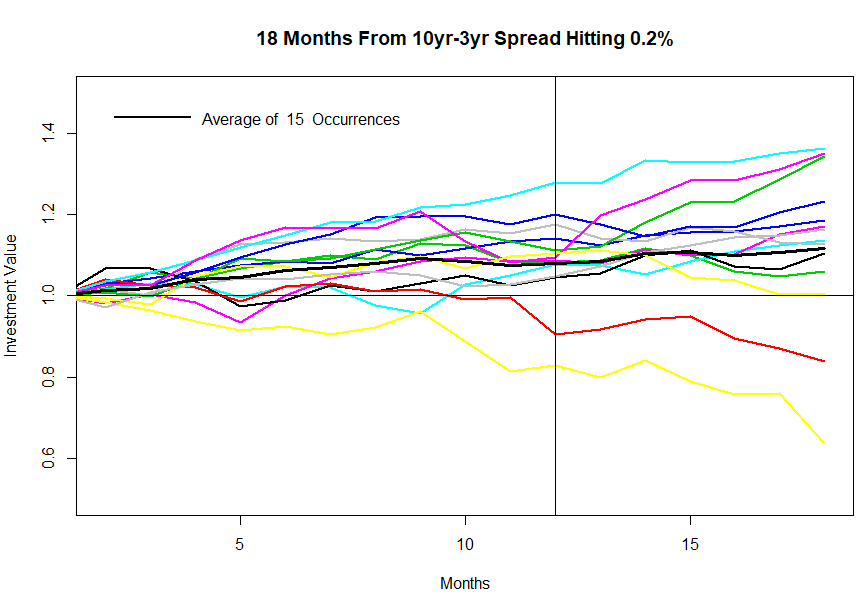
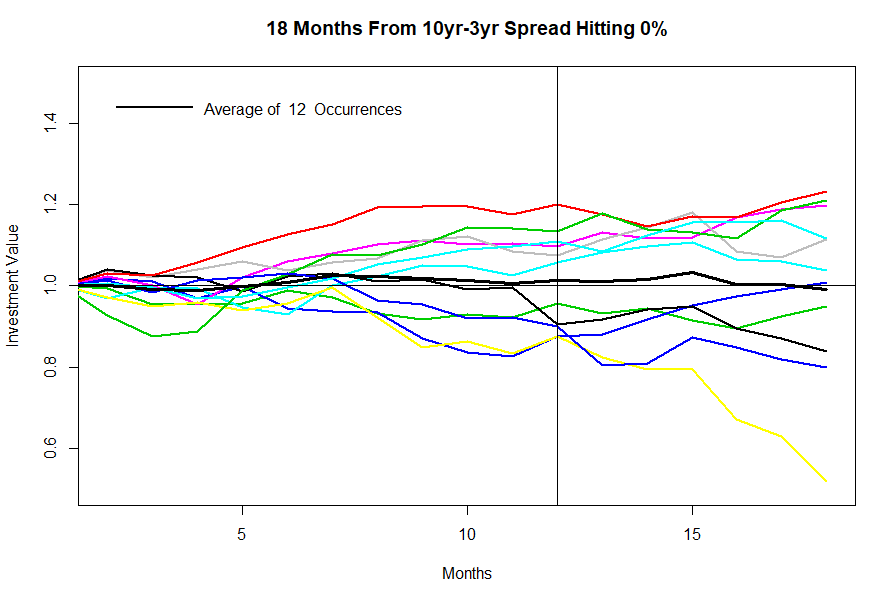
The next graph shows what happened to the S&P 500 in the 18 months following each of these interest rate inversions. Sometimes the market went up, and sometimes down. But, the average (the heavy black line) went down some, but not too much. Investor fear comes from seeing that a few of the rate inversions led quickly to market catastrophies. (By themselves, interest rate spreads are not very accurate market predictors.)
So much for the scare factor — interest rate inversions can lead to very bad outcomes. The good news is that currently most of the spreads in interest rates have not hit zero or inverted. The 10year-3year spread is still one-fifth of a percent — not much, but some.
The Federal Reserve Board at its last meeting telegraphed that they are also concerned about the tight interest rate spread and are likely to pause further increases in interest rates. They may also slow or stop selling off their huge portfolio of long term bonds that they bought to stem the Great Recession.
The graphs below shows what has happened when the 10year – 3year spread does not drop all the way to zero, but just to the current level of 0.2%. On average the stock market goes up — not always, but often.
So, don’t worry too much just yet.